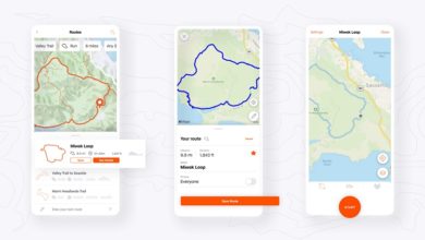
Runkeeper has released a new update to its Android app that brings a fresh new interface. The icons have been overhauled and the new design follows Material Design guidelines better than before.

Runkeeper had updated its iOS app with a fresh new design a while back. The developers of the app had promised to release a similar refresh for the Android version as well and today we see that in action. The new app does away with a bright blue colour in favour of turquoise. This looks much better coupled with a hamburger menu. The tabs have been done away with. The icons may look a bit too iOS-y, but they look quite good even on Android.
No changelog was released, so we are assuming that nothing beyond the user interface overhaul is new in this update.
[appbox googleplay com.fitnesskeeper.runkeeper.pro]


