News
MIUI V6 for Mi3 Preview
Microsoft may not have succeeded (much) with Windows 8 and Windows Phone but their design principles showed the way forward. Windows Phone brought flat user interface, popularly known as Metro design language, to smartphones and Microsoft quickly applied the same to Windows 8 (desktop/laptop tablet OS). It was a breath of fresh air as we were bombarded with operating systems that wanted to be like OS X with too much of gloss and transition effects. Apple redesigned iOS 7 around flattened user interface, is bringing the same to OS X with Yosemite.
Google said, we are not addicted to glossy and with Android L, they announced material design. Material design lays heavy emphasis on flat UI design.
it allows interface designs to be more streamlined and efficient. It is easier to quickly convey information while still looking visually appealing and approachable. Additionally, it makes it easier to design an interface that is responsive to changes in browser size across different devices. With minimal design elements, websites are able to load faster and resize easily, and still look sharp on high-definition screens. — Wikipedia (http://en.wikipedia.org/wiki/Flat_UI_Design)
Why are we talking about Flat UI Design when the title said ‘MIUI v6 preview’. Well, with MIUI 6, Xiaomi took the same route. They took Android 4.4 kitkat (which does not incorporate Google’s material design) and made it absolutely flat looking. True to the Wiki article, the user interface is now lively, colourful and so sharp that it may cause eye sore to others.
How to install update 4.8.29/MIUI 6
MIUI 6 is not available as a stable ROM as of today. Your phone need to have developer ROM v4.8.22 to receive OTA update or you can download the ROM from this (http://en.miui.com/download.html) page and install it on your phone. You will not have to do any reset (clearing cache is enough) but we suggest you do a full backup and do a reset before installing MIUI 6 (update v4.8.29).
Remember this: Miui 6 is currently in beta version and we cannot be held responsible for any issues that come up. The good thing though is that if you happen to break your device’s ROM, Xiaomi will re-flash the phone for you.
Lock screen and home screens
This is definitely one of the cleanest looking ‘stock’ lock screens that you see on Android. Time and date are displayed on top left corner and the widget is absolutely elegant. Notification bar is visible at the top. Though the top bar is visible, the total number of notifications (as a digit) is displayed just above the ^ symbol.
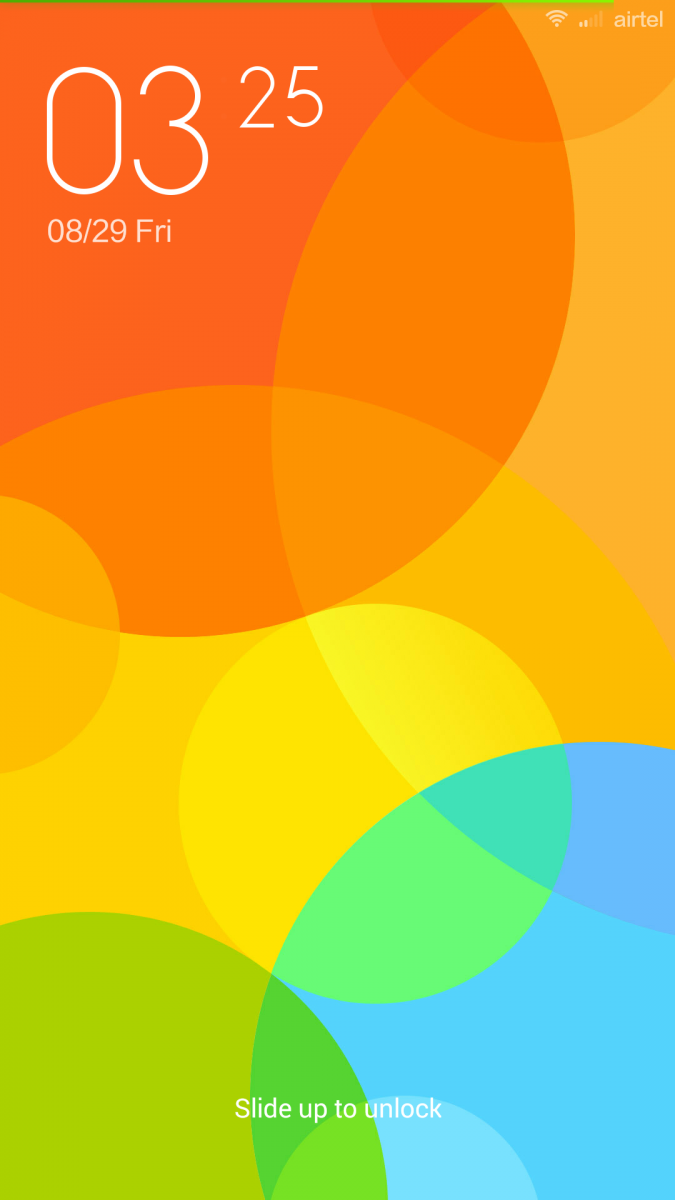

One design flaw here is that pulling the digit up does not open application (even though the notifications are from single application). There is no lock screen widget support, no lock screen shortcuts (we expect these to be added in future) so those who use these extensively should opt for another lock screen. One way you can change the look and feel of lock screen is by using themes. There are handful of themes that you can download from themes applications. Some of these change the look and feel to such an extent that you will doubt if it is android that you are using.
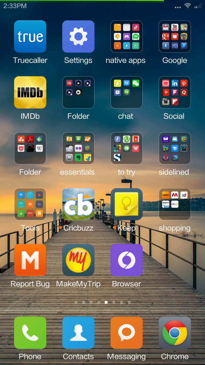
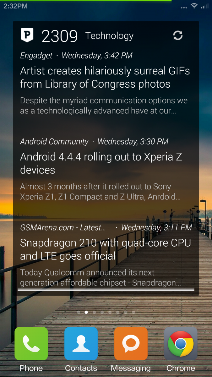
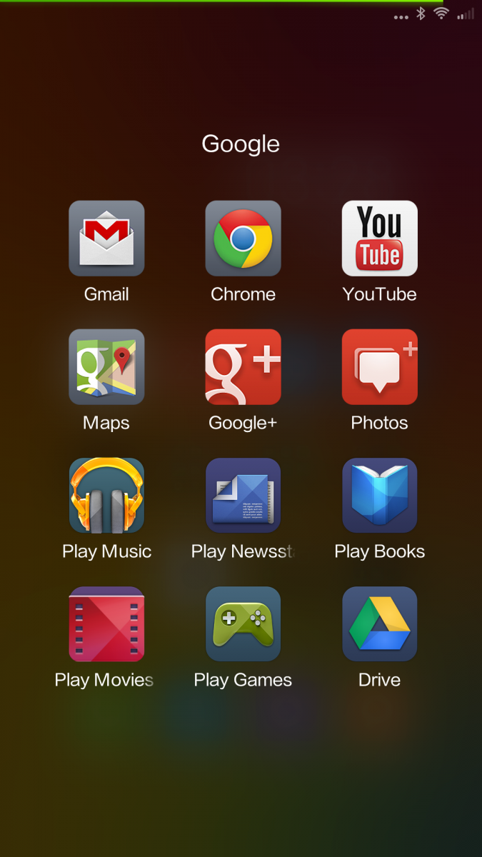
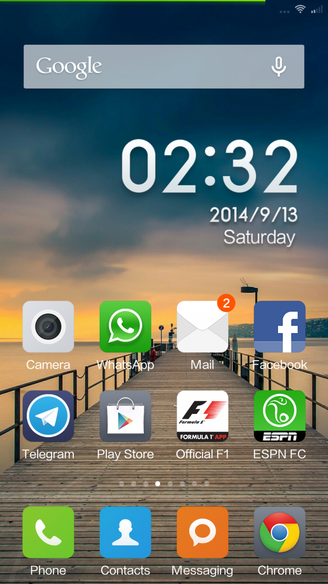
Before we go through home screen layout, do note that in MIUI 6, the ‘menu’ capacitive touch button action has changed a bit. a click opens task manager / app switcher and not the menu. To launch menu, you need to long press the menu button.
It is after you unlock the phone that you see the beautify of MIUI’s flat design. As before, there is no app drawer here. All the applications are placed on home screen(s). If you think that this is straight away iOS copy, note that the default launcher does support widgets. Though, at first look it looks a bit like iOS, once you configure the home screen layout to your liking, MIUI looks every bit Android.
At least on the test unit, there is no ‘launcher menu’ from where we can configure launcher settings. Long press of ‘menu’ key does nothing (it does launch menu in apps properly). We do hope that this will be fixed in future updates. Even in settings application, we couldn’t find launcher settings tab. For now, you can pinch in on home screen to open home screen customisation bar from which you can move icons/folders, change wallpaper, add widgets and change transition effects. The batch move feature is most helpful in organizing this icon driver interface.
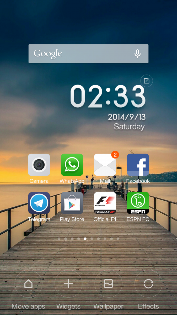
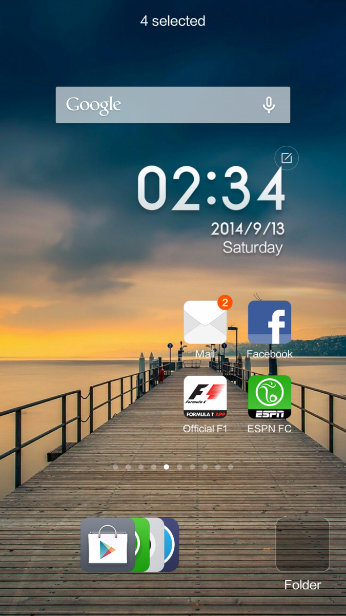
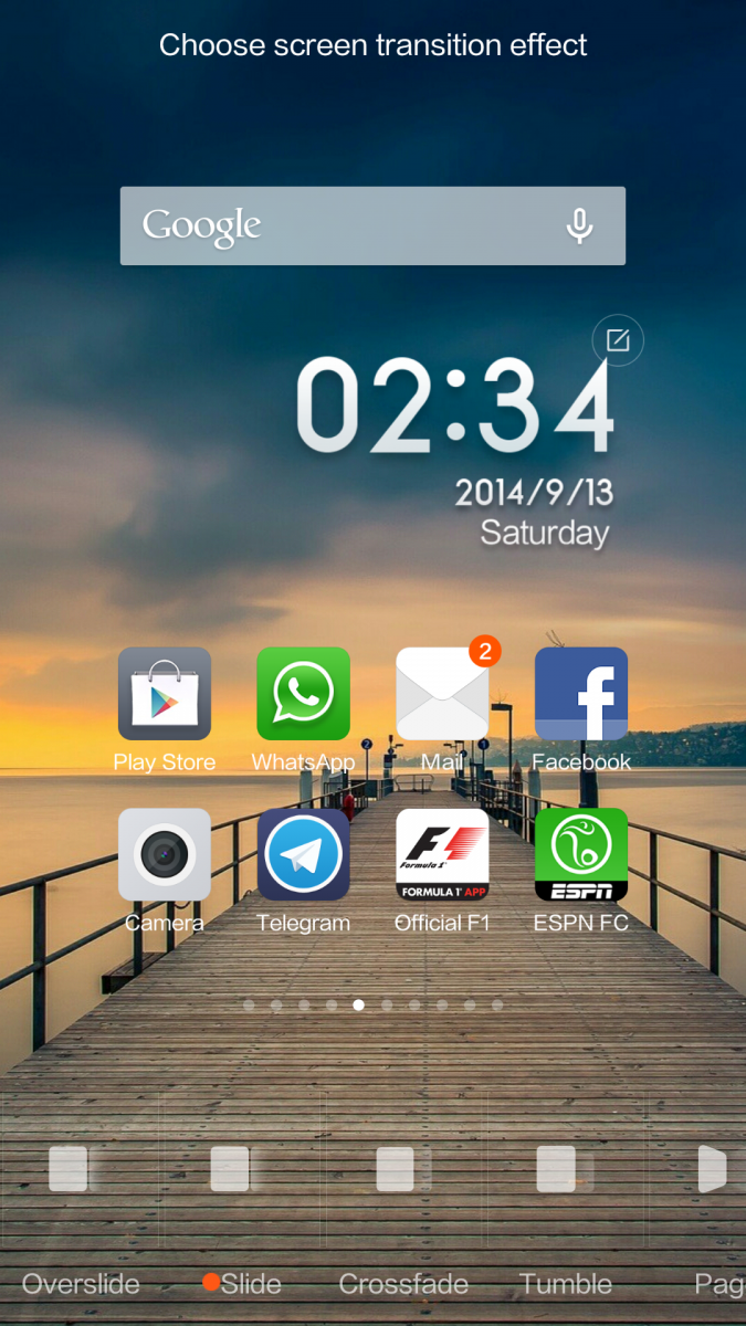
Once you are into home screen edit mode, a tap on any icon moves it to the bottom bar and you can move any number of icons. Do note that you cannot move a folder to the bar. Once you have a list of apps that you want to move to a folder or to a different home screen, you can swipe from left to right on the bar and all the icons form a tight stack. Apart from the stack, there is a blank folder icon (clicking on which an empty folder is created on home screen). You can now move this stack of icons to a folder or a new home screen. IF you want to place an icon on a home screen, open the home screen and tap on the app icon in the bottom bar and the icon occupies a free space on the home screen.
Apart form batch move functionality, there isn’t much different to talk about. The default clock on home screen is simple. no weather data, no ticket. Just a simple clock and if you want to use a different design, go to home screen edit mode, click on ‘edit’ icon that appears and you can download different clock styles.
You can access notification bar but doing a vertical down swipe on any home screen (no need to pull the notification bar from the top) and you will get to notificatiion area. The notification area is divided into two pages. Page one is what you see by default, displays all notifications. horizontal swipe will remove notification from the list but you cannot pull the notification down to view more detail. You either close the notification or click to open application. Swipe right to left to access toggles (page two). You can only add a maximum of nine toggles here so choose wisely. Display brightness selector, clock and settings icon are static in this page. Good to see that Xiaomi has provided built in torch light and a toggle for the same available to be added to toggles grid.
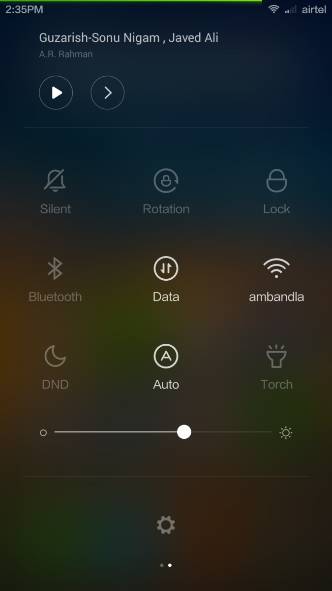
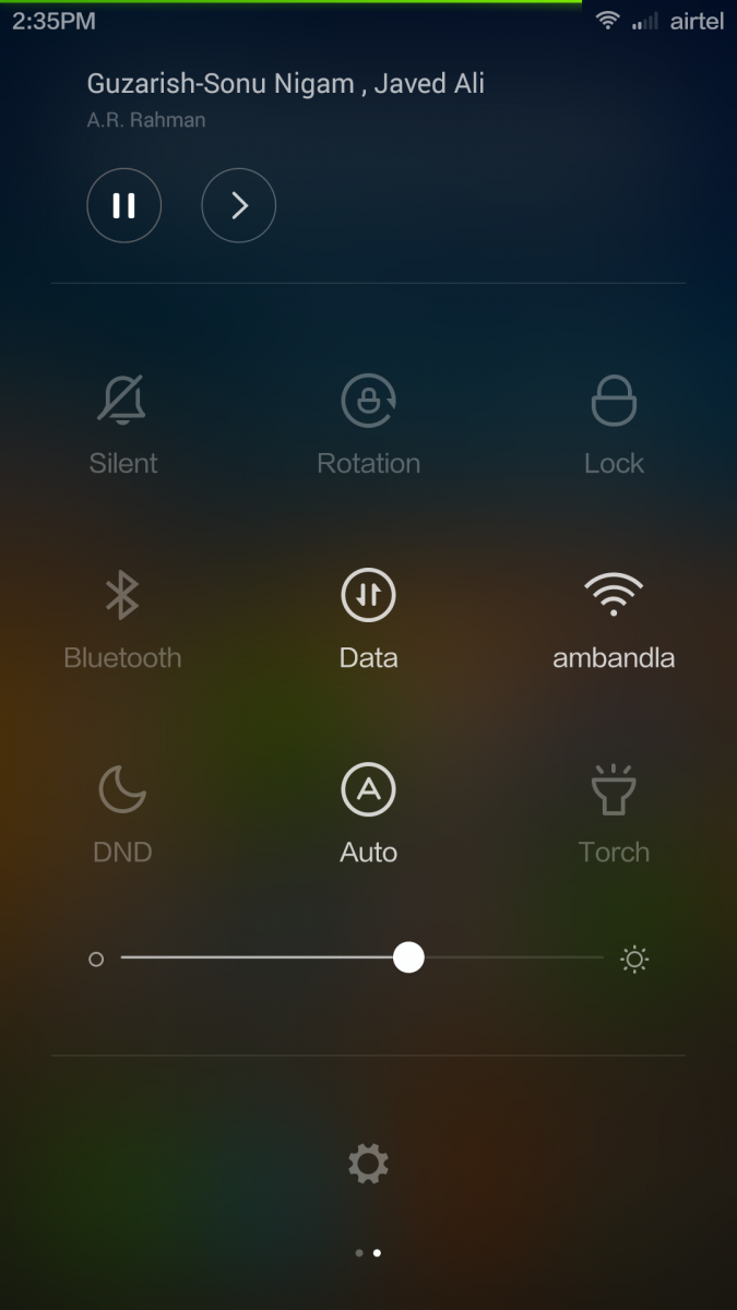
Some may say that the settings application looks a bit like iOS but we feel that this is more inline with Google’s Material Design. More and more android OEMs are going for black text on white background for settings (instead of antique looking white text on black).
Dialer and contacts
We have used some clean looking dealer applications but this one beats them all by a mile. The design is generic but it is the font, color combination and large dial pad that makes this look elegant. As usual, you can see a list of dialled/answered/missed contacts/numbers. Click on a name to re-dial or you can click on ‘>’ to check more detail about the contact and to check call log. Yes, there is a proper call log for each contact (something that you won’t see on every phone). From the call log, if you have recorded any call, you can access voice recording. You can clear the call log with one click on ‘bin’ button.
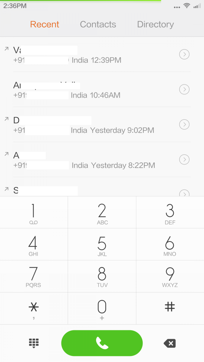
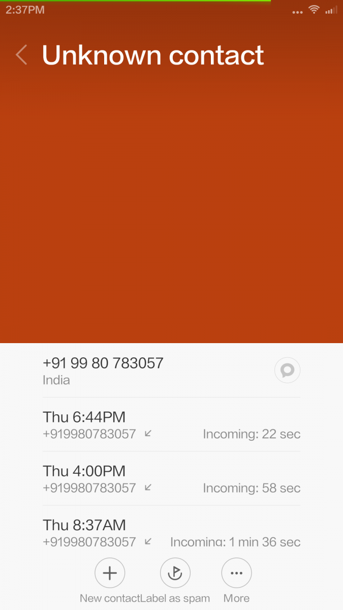
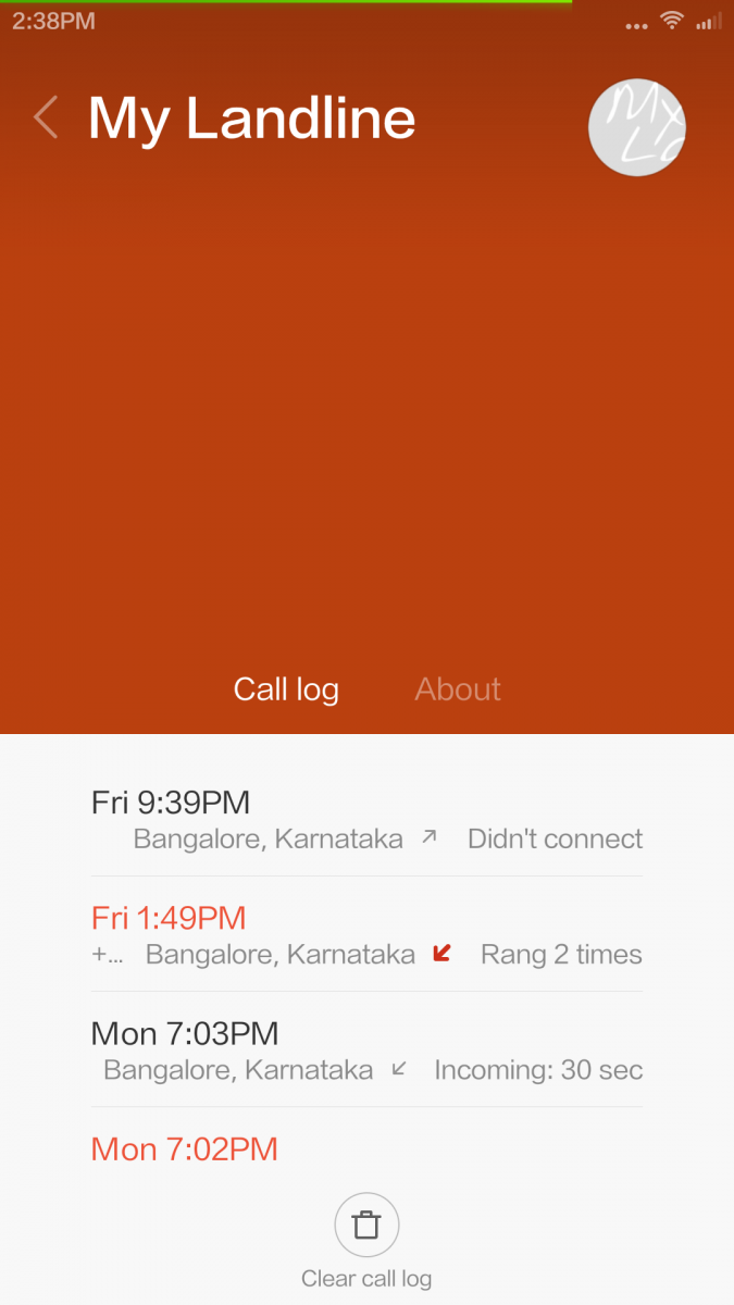
From the contact detail window, you can add contact to favourites, share contact detail to another person/app, delete contact, save contact, add the contact to home screen or add the contact as a ‘direct dial’ on home screen. When you click on a direct dial contact icon on home screen, a call is placed (instead of opening the contact data).
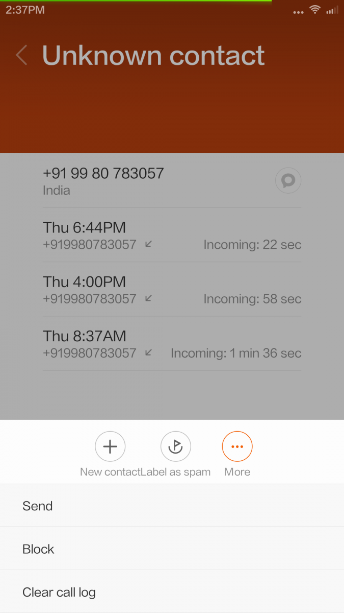
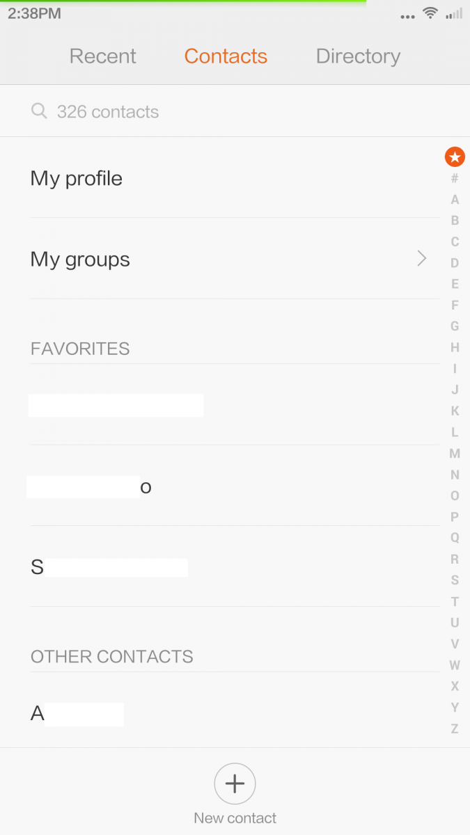
From the main screen in Dialer, swipe right to left to access your contact list (this is same as the contacts app). Link to access groups is at the top of the list followed by all your favourited contacts and then the full contact list. As you slide, the alphabet corresponding to the current list seen on page glows orange. There is a telephone directory in the application but as of now, the font is Chinese and we guess it is limited to telephone numbers in China.
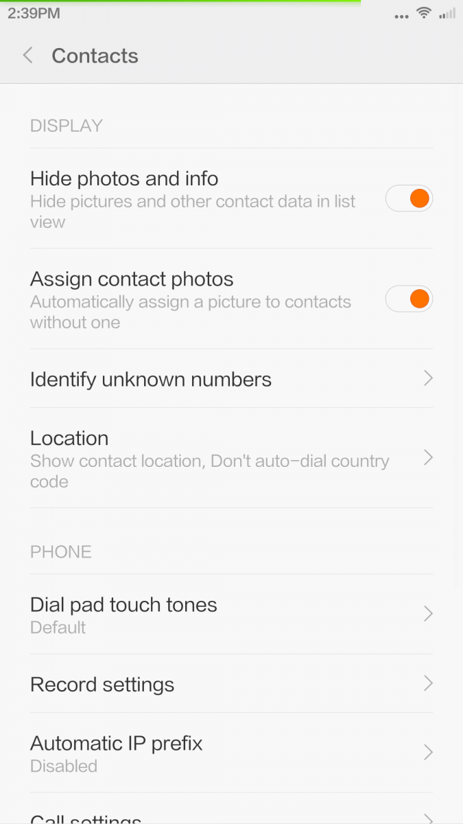
From contacts settings menu, you can
- Hide/display contact photos/info
- Assign photos to contacts automatically
- Identify unknown caller. Xiaomi have a service similar to Truecaller that identifies unknown caller (should be connected to internet) so you get to know to whom the unknown number belongs to and you can block telemarketing numbers from here.
- Location detail
- Dialpad tones
- Record settings
- IP Prefix
- Import/Export contacts
- Set display preferences (sort by, SIM contact on/off, smart grouping, accounts to use to display contacts, merge, batch delete, clear data etc)
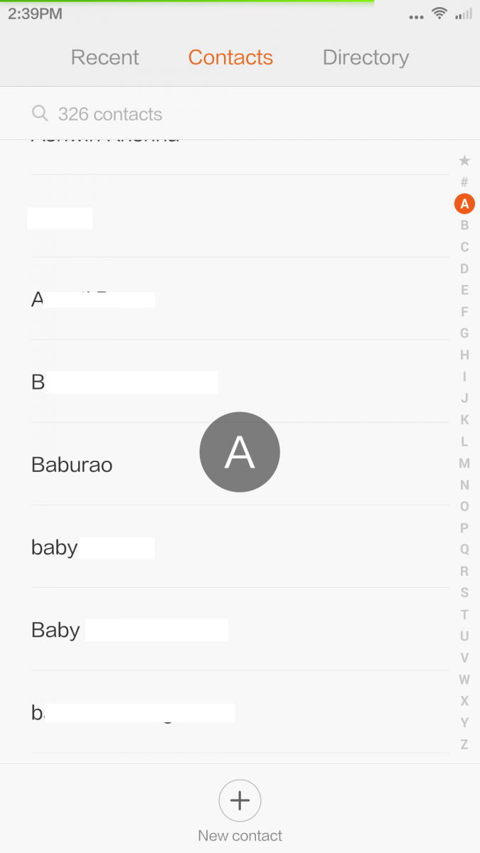
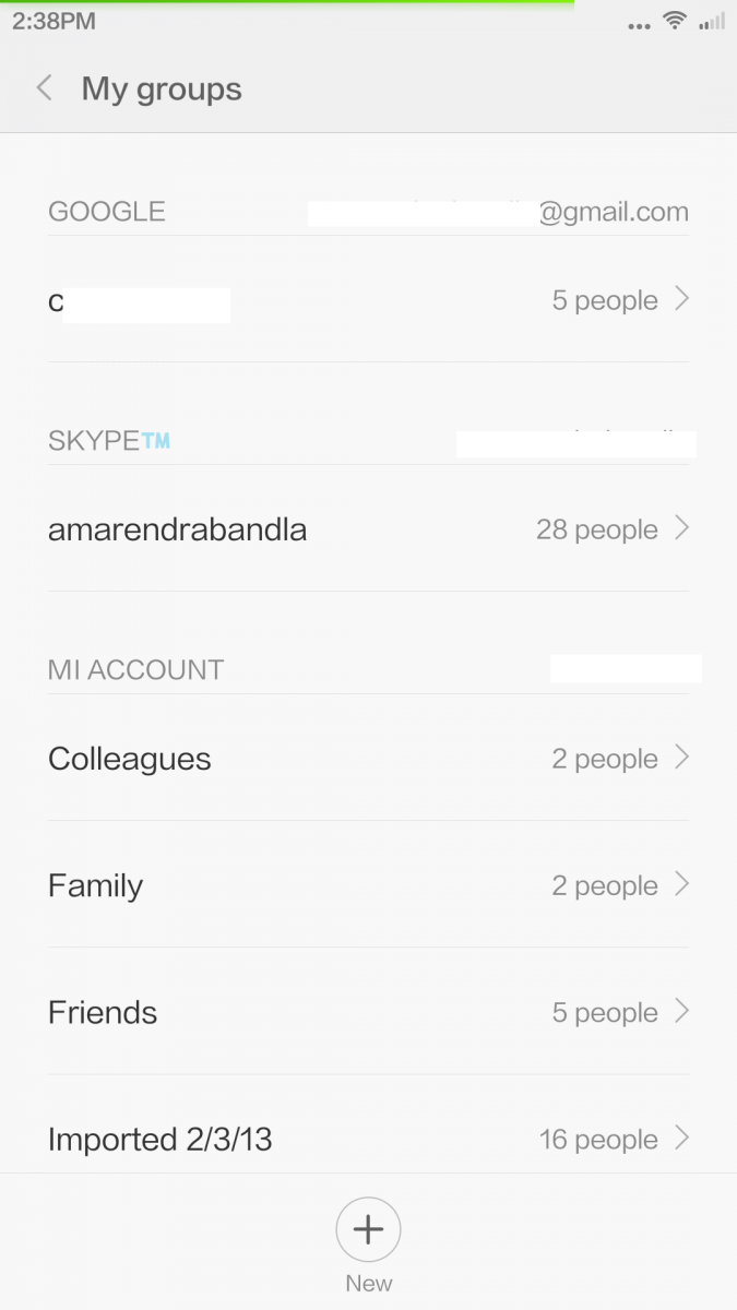
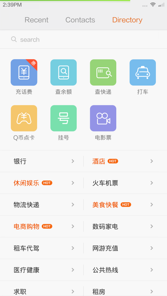
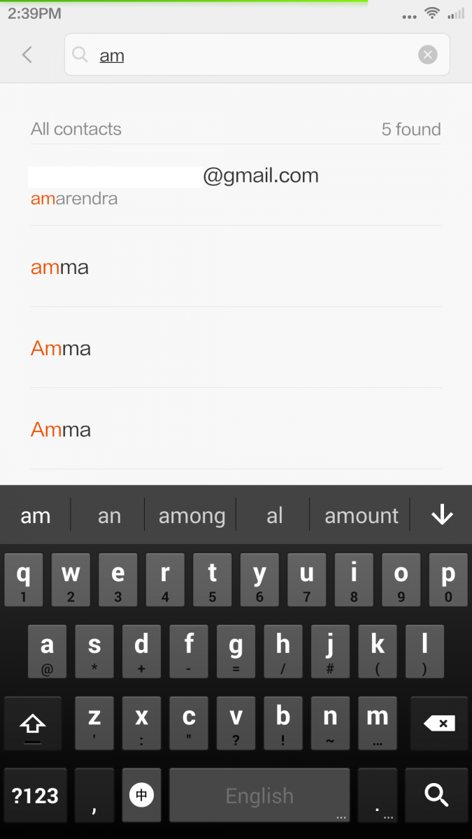
When you are in a call, apart from usual options, you have option to record the call, add notes and assign the note to the contact. These two features are very useful, especially when you are on phone with a customer care executive and you want to record the call and note down reference numbers etc. You can configure the notes to sync to Mi Cloud so that you can access the notes from any device by logging in to Mi Cloud using a web browser.
Messaging
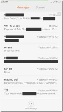
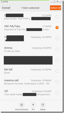
In line with all messaging apps, the stock app supports threaded messaging. Messages home gives you list of message threads (sorted by default by time/date). In line with overall UI, the messages app is absolutely clean. Search bar is placed at the top Swift left to access starred/favourited messages and ‘new message’ icon is placed at the bottom.
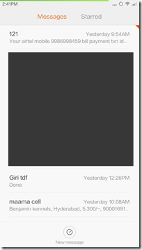
Pull the page down (takes some effort, we would suggest a two finger run down pull) to open ‘private messaging’. In short, you can move your ‘extremely personal and confidential’ message threads to private messaging section. You can set a password for this so you and only you will be able to access your private messages. Awesome trick, isn’t it?
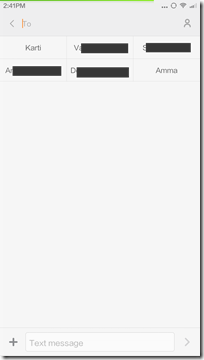
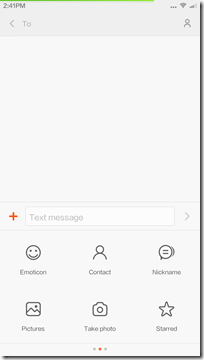
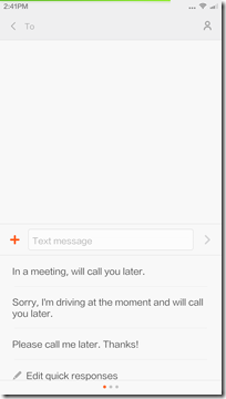
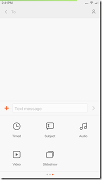
In ‘new message’ window, To field is at the top and your recent messaging contacts are listed below To field (maximum of 6). This makes it easier for you to pick contacts. If the contact is not in the ‘recents’ list, you can click on ‘people’ icon in To window to open contacts list. Or you can start typing name or number and you will see the search results as a drop down list.
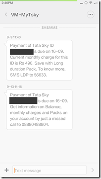
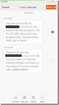
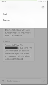
Message thread view looks super clean. No photos. Simple text with good amount of gap between each message (green background for your sent messages and white for messages that you received). When you are in a message thread, click on ‘…’ icon to open contact detail or to call the contact. Long press on any message and you get options to forward/copy/delete/lock/view detail options. From this view, you can select multiple messages and you can do batch delete/copy/forward of these messages.
When you enable ‘cloud messaging’ all the messages are synced to your Mi Cloud account. If you do not want your messages to bey synced, make sure that this option is disabled. Advantage with MiCloud is that you can send a new message or reply to messages from the Cloud.
Web Browser
The stock browser is absolutely feature rich but a big pain to use. The one on MIUI v6 crashes a lot, won’t play youtube videos properly, difficult to disable and want to be the default application for everything. In short, we would suggest you to disable this one and make your favourite browser as default browser.
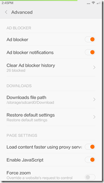
The stock browser comes with bar code scanner, data compression, multiple search tools, ad blocker, pop up blocker etc. But one problem though is that this browser acts as ‘default app’ for many. For example, if you are on twitter app and want to open instagram photo. The photo is opened in web browser even though you have an instagram application. You don’t get the ‘default app selector’ pop up. Browser is the master app for all. The only way to stop this is by uninstalling the browser and setting an alternate web browser as default browser. To fix that, you have to set another browser as the default browser from settings –> install apps –> default apps setting option.
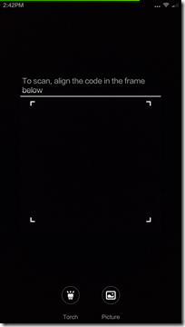
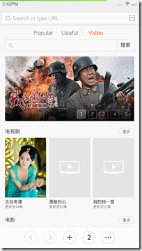
Search and URL bar is placed at the top of the browser window. there is a [-] icon on the right side of this bar. Tap this to scan a bar code. You can use your camera to scan a bar code or you can use a photo containing a bar code and you can scan the bar code. In case you are in a dark environment, you can click on ‘torch’ to lighten up the subject.
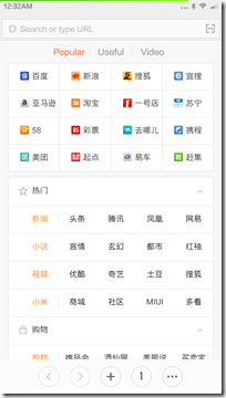
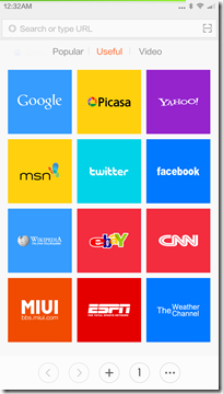
Home page has Popular, Useful and Videos views. Forget about popular and videos lists as these pages have Chinese font and by no means useful if you are a non-Chinese user (this is because the beta ROM is meant for China region). You can add your favourites to ‘useful’ page.
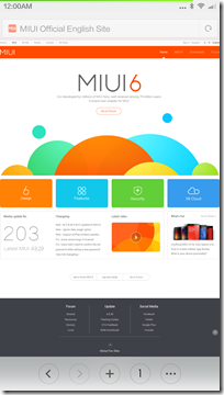
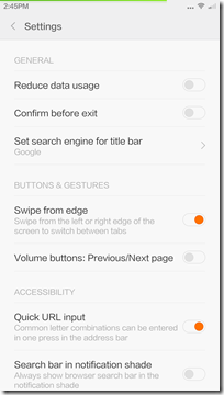
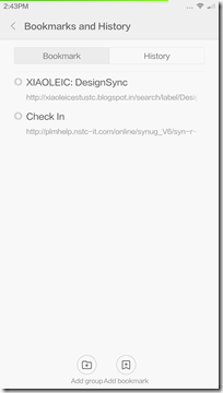
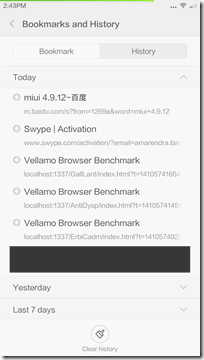
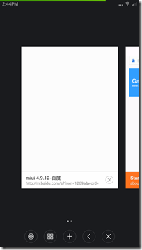
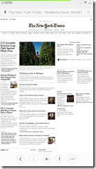
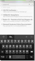
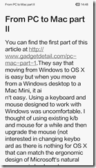
We are not going to do a full walkthrough of this application as most of the features are very much in-line with most browsers available for smartphones. There are few features that are helpful like ‘swipe from left or right edge of screen to switch between tabs’, use volume buttons to open previous/next page, add search bar in notification shade but this only works with Baidu search. Here are a few screenshots that gives you a clear idea on how the browser works. Performance wise, the pages load very fast and if you need a clean UI, you can switch to text view which gives text only view of article without any ads, frames (as seen below).
Email
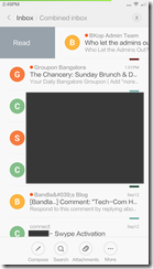
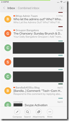
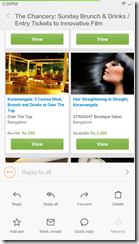
Absolutely beautiful. Again, no fancy stuff here. Text and flat icons take centre stage and the end result is a clean looking, easy to read layout of mails.
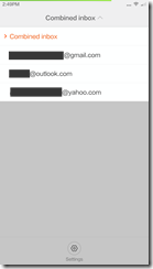
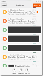
Pre-loaded application does support combined inbox. Each mail account is assigned a color and when in combined Inbox, individual mail is assigned same color that was assigned to the mail account. A red dot next to sender’s name denotes unread mail while total unread count is displayed in top right corner.
From conversation view, you can compose new mail, do a search, check downloaded attachments, open folders.
Email formatting is clean, full HTML view is enabled by default and there is no ugly formatting issues.
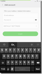
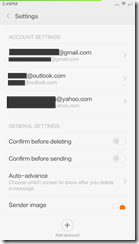
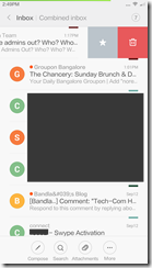
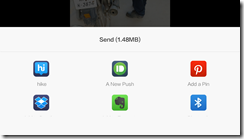
By default, the bottom pane gives you option to reply to all. For any other action, click on ‘…’ (reply, forward, delete mail, favourite, marking, quick reply, move to folder etc). While in conversation list view, swipe left to reveal delete and favourite buttons while a right swipe gesture will mark an unread email as read and a read email as unread. Long press will let you perform batch operations (delete, unread, favourite). Settings menu is straight forward. Adding account, account specific settings, feedback pages are accessed from settings menu. Notifications for emails are displayed at the top (as seen in the screenshot here). One tap and the mail is opened in mail application and side swipe will clear the notification.
Music
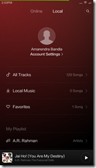
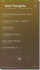
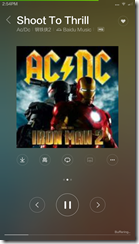
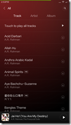
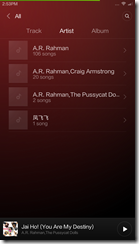
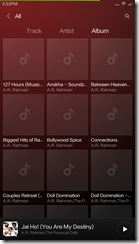
Though it looks like just another music application, there is lot to it than just ‘load and play’. The music player by default lists online content from Baidu Music on main window. The content on home screen is all Chinese but click on ‘search’ and you can find your favourite band/artist/album. You can download music while you are playing songs but the bit rate maximises at 128kbps (which is enough for an average Joe). If you need high quality stream, you will need a subscription plan (costs 3 Mi credits per month). We were indeed surprised to see lot of Indian content in Baidu Music. We did a search for A R Rahman’s music and there were 128 songs. Thanks to this, if you have a good 3G/4G plan with good download cap, you don’t need to have any music saved to your local storage (which is a premium given the lack of SD card expansion).
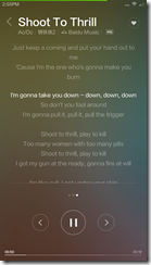
‘Now playing’ window displays song list, album art and lyrics views. Playback controls are simple and straight forward, seek bar is at the bottom and is interactive. Tap on album art to reveal audio settings, shuffle options, share/send-to and download tabs. Click on ‘heart’ symbol at top right corner to favorite a song.
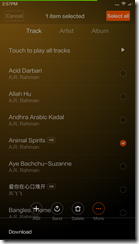
From local music section, you can view songs list, create playlists. Long press on a song and (similar to messaging, mail apps) you can do batch edit (delete, move etc).
Aesthetically, this application is not as refined as other pre-loaded applications but hey, when we are getting all this content for free, it doesn’t matter.
FM Radio
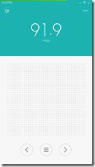
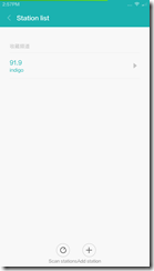
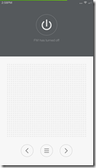
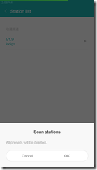
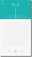
FM Radio user interface is absolutely minimalist yet it looks gorgeous. The top quarter of home screen has fm on/off key, radio station frequency indicator, menu key. the bottom bar has keys to switch between stations. Use arrows if you want the app to switch to next available frequency while the centre key gives you a list of saved radio stations.
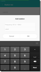
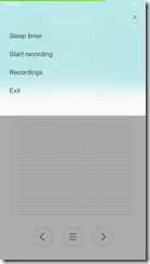
From the menu, you can set sleep timer, add a radio station to list, start recording of station, accesses recordings and exit the applications. IF you want to manually set to a frequency, top of the frequency that is displayed and you get a frequency band. swipe left/right to go to your desired band.
Most of the time, we kept the phone indoors, the phone wat not able to pick up signal. Even a 2,000/- phone picked the signal in a better manner. Irony here is that the Redmi 1S that we have at home had much better FM reception than Mi3 so we this could be a software problem.
Camera
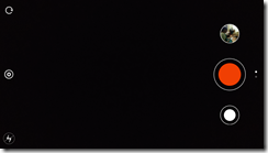
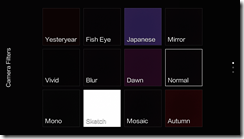
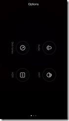
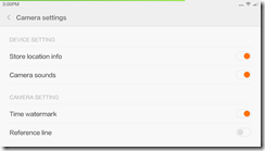
Clean and generic UI is what this application has. (In landscape mode) The left strip has ‘camera switcher’, ‘flash on/off’ and settings keys while the right strip has shutter key, photos icon and video record button. Swipe down for camera filters and swipe up for other options (add audio to still image, skin tone settings, HDR, HHT etc). Overall, the application is extremely simple so here are a few screenshots
Gallery
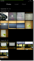
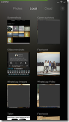
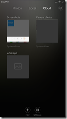
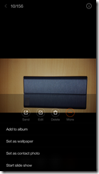
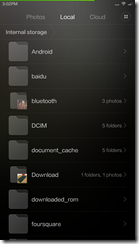
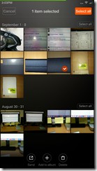
By default, images in gallery are sorted by date. Main screen has three different views : Photos, Local and Cloud). Local content though is sorted by album/folders, photos views is organized based on date and cloud is sorted by folder name.
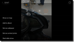
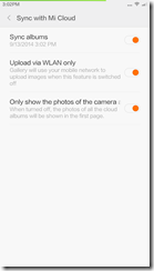
You can adjust cloud sync settings from settings menu. From local view, you can open directory listing of phone’s storage. Long press a photo so share photo or to add the photo to album or to delete the phone. Again, this is very similar to batch edit mode in other native apps. You can make private albums hidden. Sorting of images can be done based on date, name and size.
i.mi.com is the cloud location where your photos are stored (If sync is enabled). Overall the interface is clean and is absolutely fluid. Scrolling is butter smooth, gestures does not show any lag. Switching between photos/local/cloud views too is pretty fast, thanks to the Snapdragon 800.
Other native applications
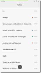
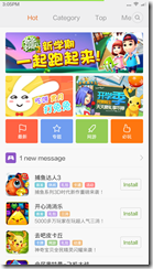
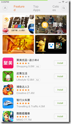
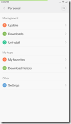
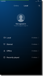
Here are screenshots of few ‘very useful’ native applications
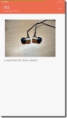
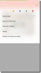
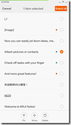
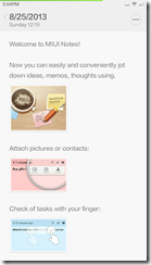
notes
video
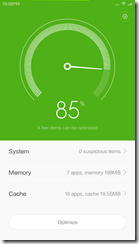
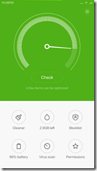
security
Bugs
- Play store crashes if Wi-FI is slow
- Play store will not download applications even if I un-check ‘download via wifi only’ option
- Browser won’t play videos on youtube and will not let youtube to open youtube videos from other apps
- Browser is extremely buggy, crashes a lot, won’t load sites properly
- lock screen shortcuts are missing
- Launcher menu is nowhere to be found
- Widgets won’t load content. Most of the widgets stay blank.
- Notifications clean up is messy. sometimes, the notification comes back even after swiping off.
- phone won’t let use downloaded 3rd party keyboard. I have swype installed but the phone switches back to google or swiftkey even though they are disabled and not set as default. This is a major pain in the butt.
- screenshot click is inconsistent.
Conclusion
As with any beta variant of operating system, this one has lot of bugs. But, once we got used to the new UI and design, it was really hard to go back to MIUI v5. And for sure, you won’t even think of switching or trying another launcher after using this. On other phones, we used to switch between launchers every now and then but in this case, we never moved to a 3rd party launcher. It is that good and clean. After using v6 for couple of weeks time, v5 looks like an ancient OS (the same feeling that we get when we move back from Windows 7/8 to Windows XP/vista). Some of the apps user interface is amazing, simple and easy to use. But there are some things missing (that were there in earlier variant) and we hope that XIaomi dev bring them back soon.










[…] To learn more about MIUI v6, head to this page. […]