ASUS Zenfone 5 review
When the first Samsung Galaxy Note came out and started a certain ‘phablet’ market, many were doubtful about success of these humongous phones that look more like tablets on a diet. In last three years, the phablet market share kept rising and for past year or so, the market is flooded with such phones at all price points, not just by Samsung, but by every smartphone brand. Today, we have a brand new phablet device from ASUS, the Zenfone 5.
Packaging
ASUS went with minimalistic packaging, reducing the amount of paper used in packaging. Zenfone 5 comes in a rectangular phone sized box. I was greeted by massive phone’s face the moment I opened the box. Below the phone tray were the usual set of accessories (manuals, warranty info, wall charger, USB cable, in-ear canalphones and two pairs of earbuds).
Design and build quality
On first look, the phone slightly resembled the HTC One M8, thanks to its slick looking metallic strip below the screen and ultra thin bezel. Though the phone is very slim, I didn’t have any problem with the grip and the phone, though much bigger than my Galaxy S3 feels safer when I hold it. While the massive display occupies most of the front, the rear looks sexier which milky white polycarbonate plastic plate. The back plate is removable but the battery is not user replaceable. It would’ve been better if ASUS provided a unibody design with SIM/memory card slot on the side. It would’ve improved the sturdiness of the phone. Though the rear panel looks soft and delicate, the touch feel is good, the panel provide decent grip for palm and there is no worry of accidental drops. Thanks to being matte, the panel does not attract finger prints and smudges. Overall, I liked the build quality, the look and feel of the Zenfone 5. This phone, for sure, is far better than the infinite number of generic looking phones coming from South Korea.
Front side of the phone has the full set of sensors, earpiece and a front facing camera at the top. Capacitive Android function keys (return, home and task switcher) are located below the display but given the size of the display, ASUS should have provided on screen controls which would’ve reduced the length of the phone.
There are no controls on the left side of the phone.
Power button and volume rocker are placed on the right side. These controls are a bit hard to press and for someone like me with average palm size, reaching the power button while using left hand is a bit of stretch. The volume rocker keys also double up as a camera shutter and Power + Volume up can be used to take screenshots.
There is a inverted microUSB port and the primary microphone at the bottom side.
3.5mm audio jack and secondary microphone (for voice cancelling) are placed at the top.
Back side looks super clean with camera lens and LED flash at the top half. Loud speaker grill and few logos are placed at the bottom half. Opening rear panel should be done carefully. Inside, there are two SIM card slots (yes, this is a dual SIM phone) and a memory card slot. There is no wireless charging contact points and given the price tag, we are not surprised.
First boot and setup
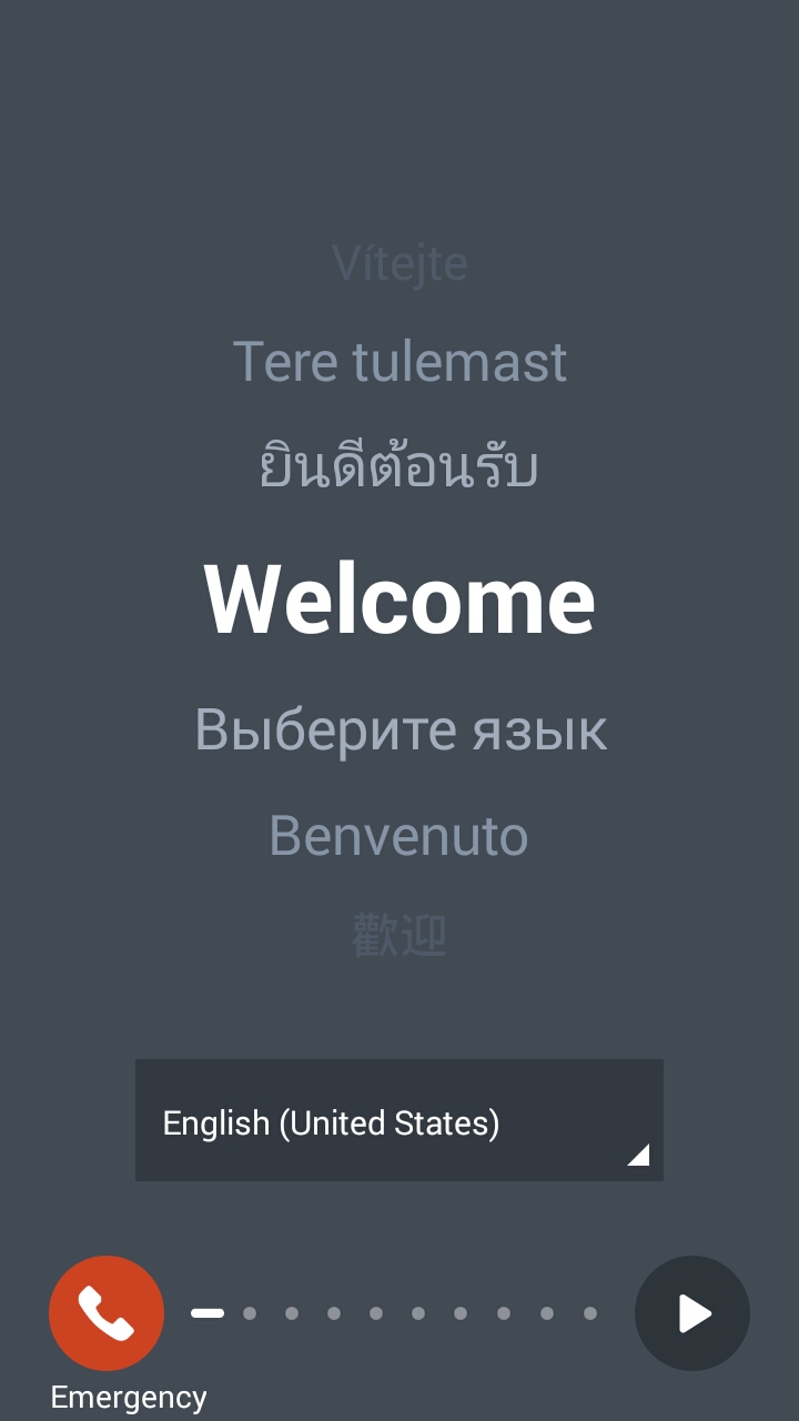
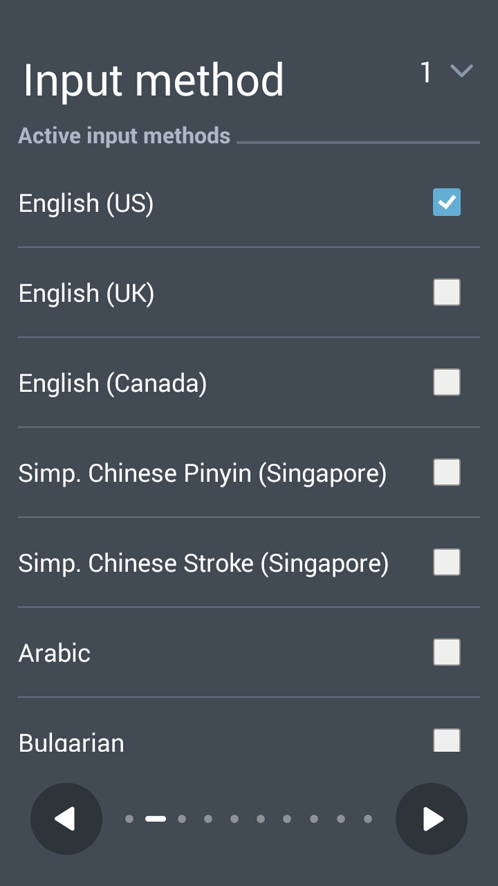
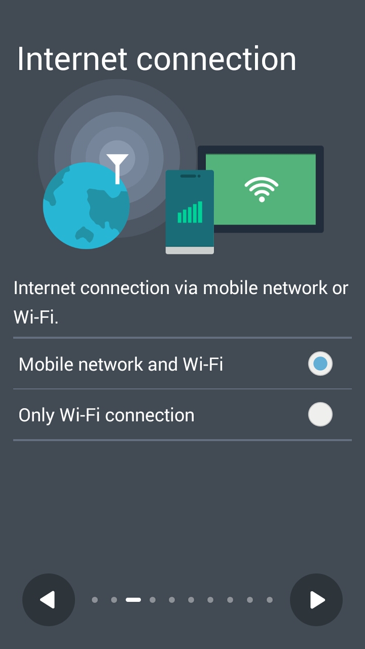
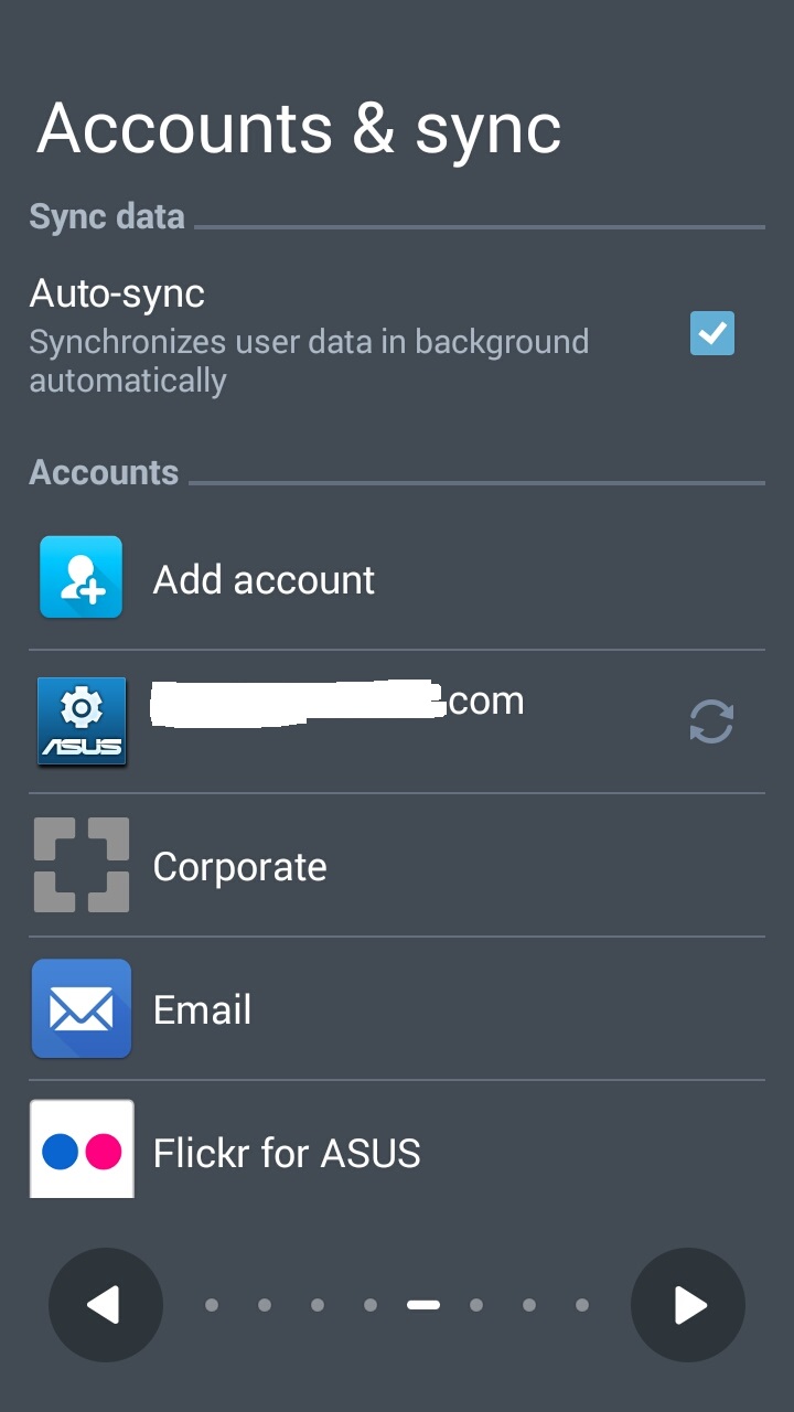
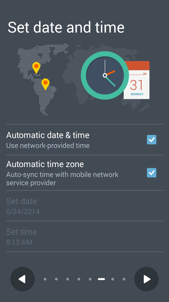
On first boot, we are greeted with a simple welcome/setup screen and once you are through the initial setup (language, region, asus and google accounts etc), a clean blue home screen greets you for the first time. We had a feeling that there is too much of light blue here and given the phone’s ppi, the white text over light blue background, though looking elegant, was not as easy for the eyes on long use as a white over black or white over deep blue (MIUI home) or black over white.

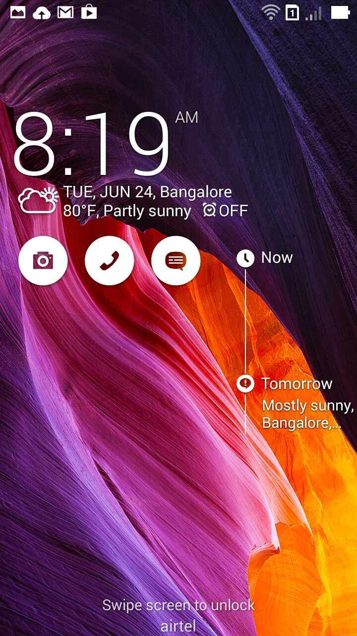
Lock screen displays wide array of information like weather, widgets, calendar events, quick access buttons for camera, phone and chat/messaging.
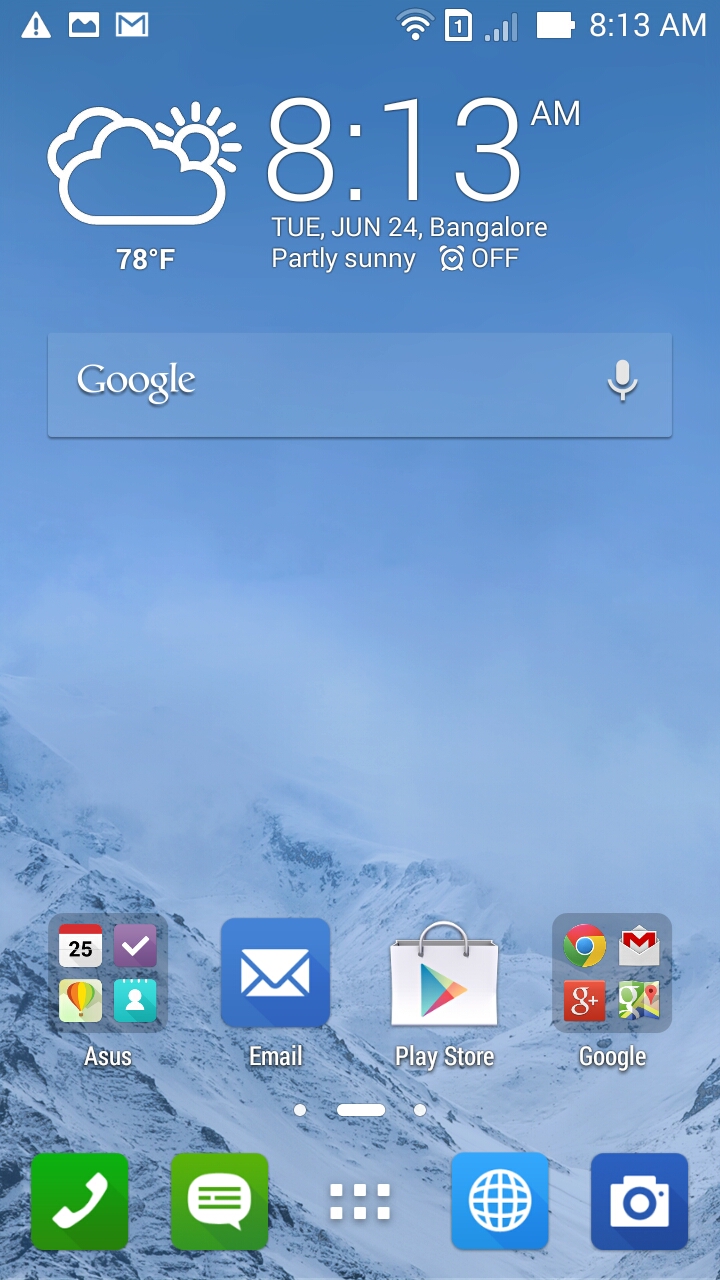
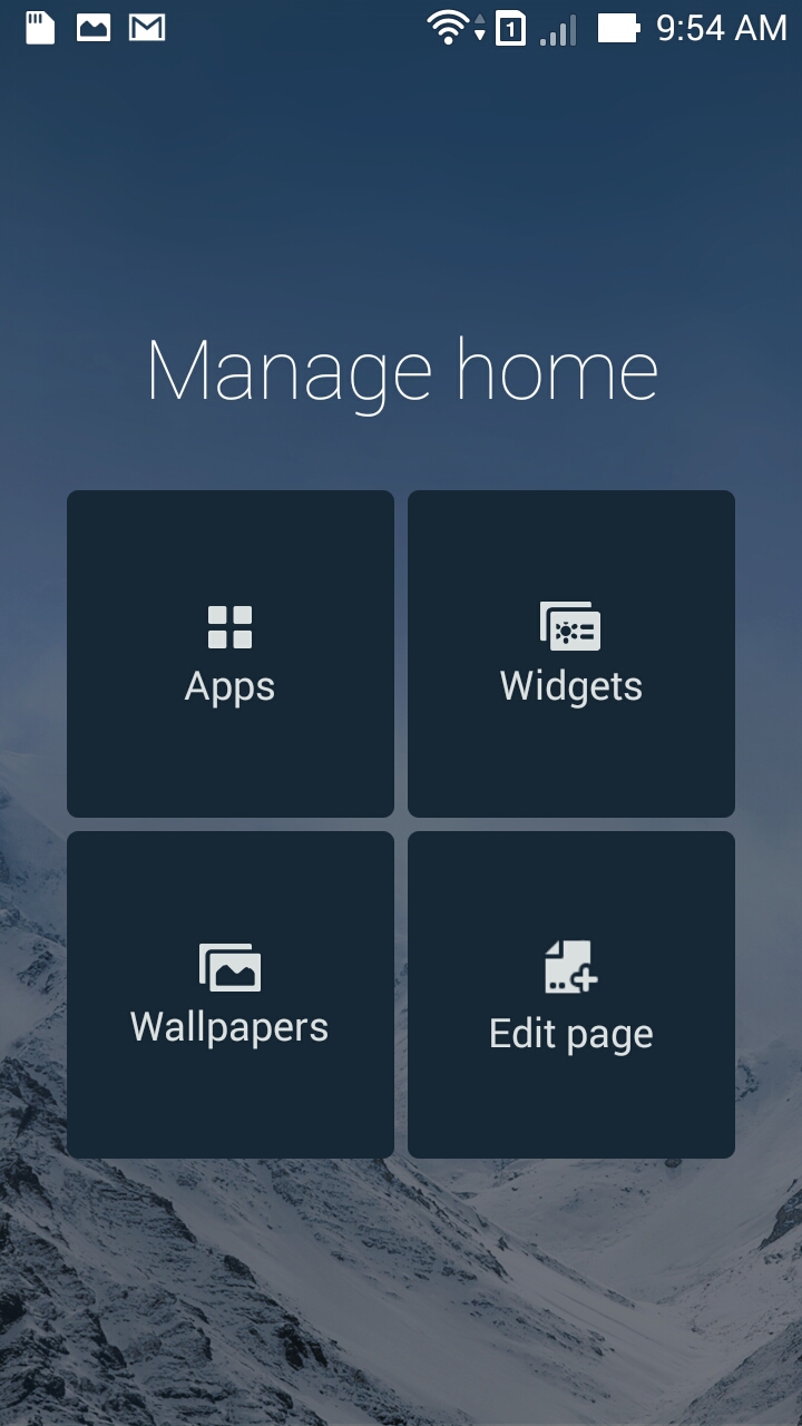
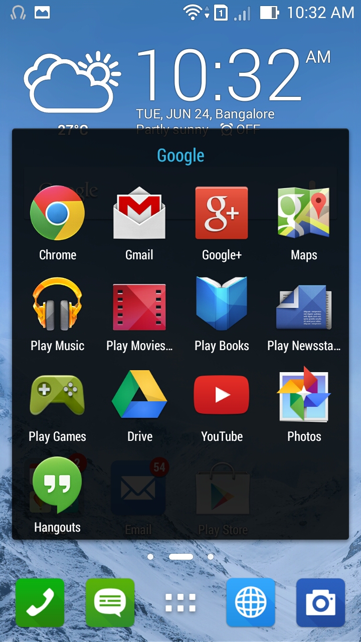
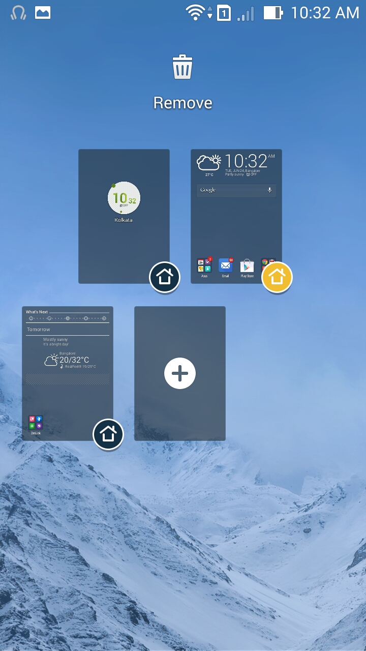
By default the home screen has weather and clock widget, few icons for pre-installed applications and a dock. ASUS provides three home screens by default and you can add/remove/organize them as you like. Long press on the home screen gives you option to add apps, widgets, change wallpaper or to edit homescreens. App/widget drawer is very similar to stock android layout. Long press home button to open Google Now (action can be changed), press the task manager key to open, well, the Android task switcher.
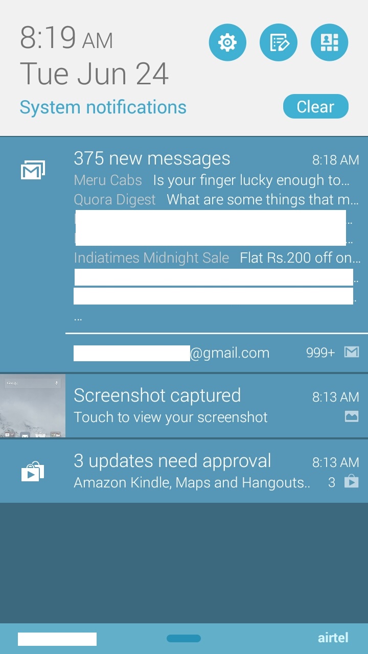
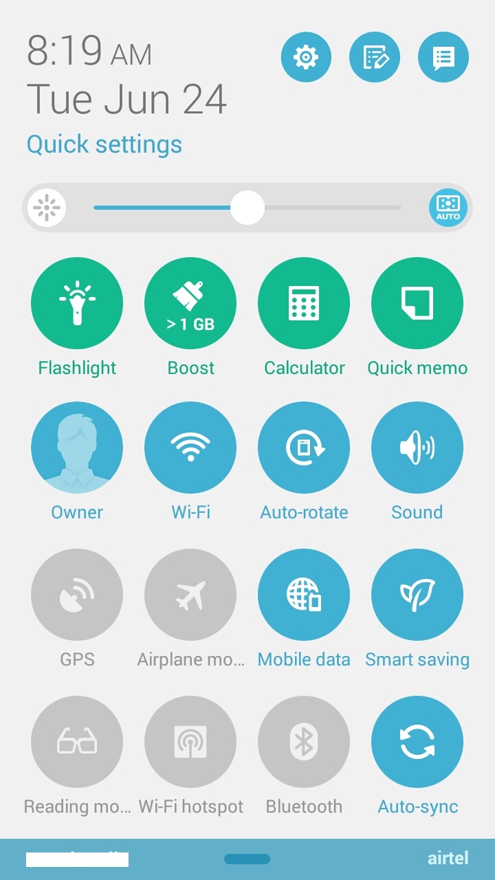
This phone’s notification/toggles bar can be used as best example of the saying ‘Do not try to fix why is not broken’. The while colour text is too thin and on light blue background, it didn’t look good. Notifications made use of Google’s card ui layout and the bottom, we get wifi said and network service provider name. The top left side of notification bar shows time and date in big font and next to that, we get options to open settings, edit quick settings (toggles) layout and switch to quick settings bar.Below these, there is option to clear all notifications followed by the list of notifications. Toggle The same UI would’ve looked absolutely amazing on a phone with super high ppi. Quick settings bar has a 4×4 layout and has rounded icon grid. The icons design is good and is easy to understand at first look.
Onscreen keyboard
Default keyboard is ASUS’s own qwerty keypad. The black text on white background is easy to look at. There are different ways to type using this keyboard:
- Easy flicking (flick the characters up as if you are throwing the key up to switch between uppercase and symbols, flick space bar left and right to change input method
- on-the-fly addition to dictionary. add words to dictionary as you type by clicking on + key
- Fast swipe input (similar to Swype style keyboard)
Prediction is good and you wont be shouting ‘damn you auto correct’ too often. There are options like auto capitalization, auto punctuation, auto spacing, next word predictions that help you with typing speed and good thing is that you can disable each of these features.
Web Browser
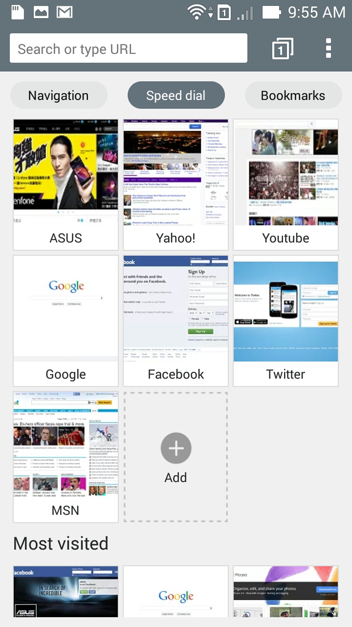
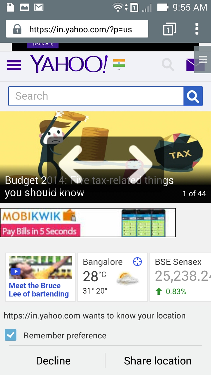
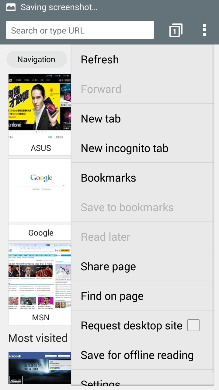
The default web browser does a pretty decent job. At the top is the address bar, next to which you can find the tab switcher and menu button. Default page displays speed dial (webpages that are added to speed dial and most visible webpages list). You can also head to bookmarks from the main page with one click. Settings/options menu is very similar to what we see on chrome browser. Page load times are good and the layout is very clean. Unless you specify, this browser fetches mobile variant of web pages. If you want some private browser, there is incognito mode built in that can be activated from settings menu. There are few interesting features like ‘search result preloading’, ‘web page preloading’ and ‘disable images’.

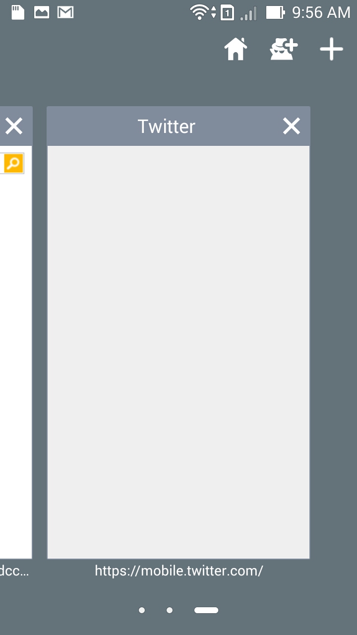

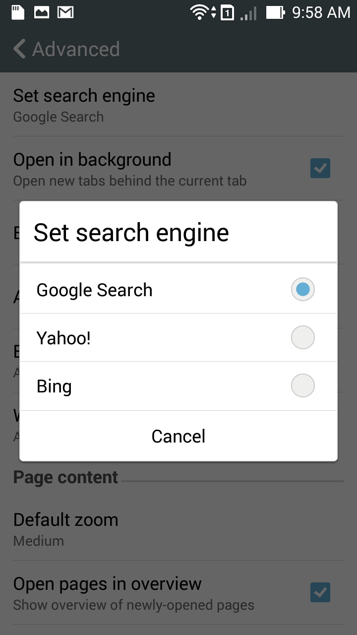
ASUS has given option to choose among Google search, Yahoo! search and Bing search as primary search engine. JavaSrcript is enabled by default so security freaks may better make a note. There is an inbuilt pop up blocker that is effective so you dont have to install another adblocker.
Calendar
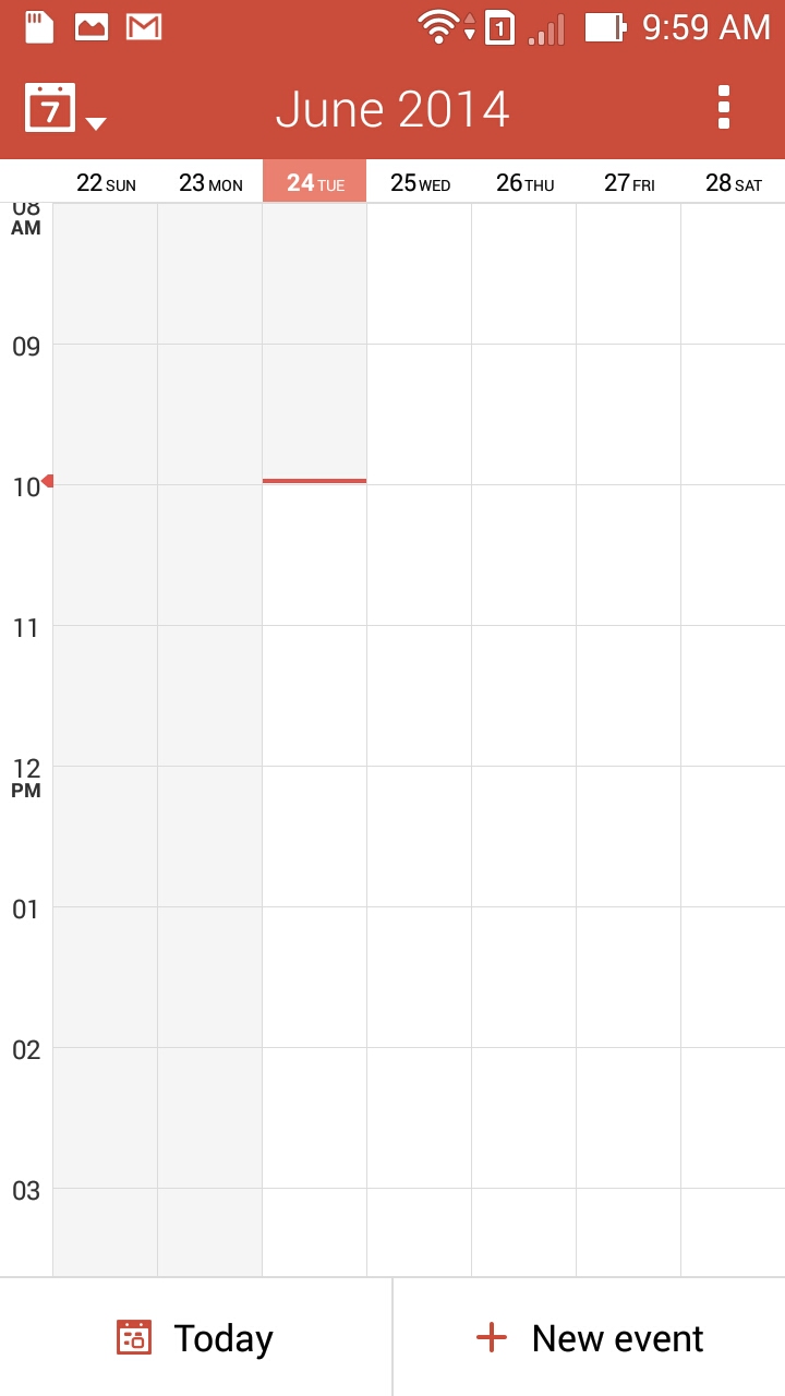
Calendar application has a clean look. Good that ASUS picked orange-white color combination here and it looks gorgeous. Default view is set to weekly view and there is one click access to current day schedule or to create new event.
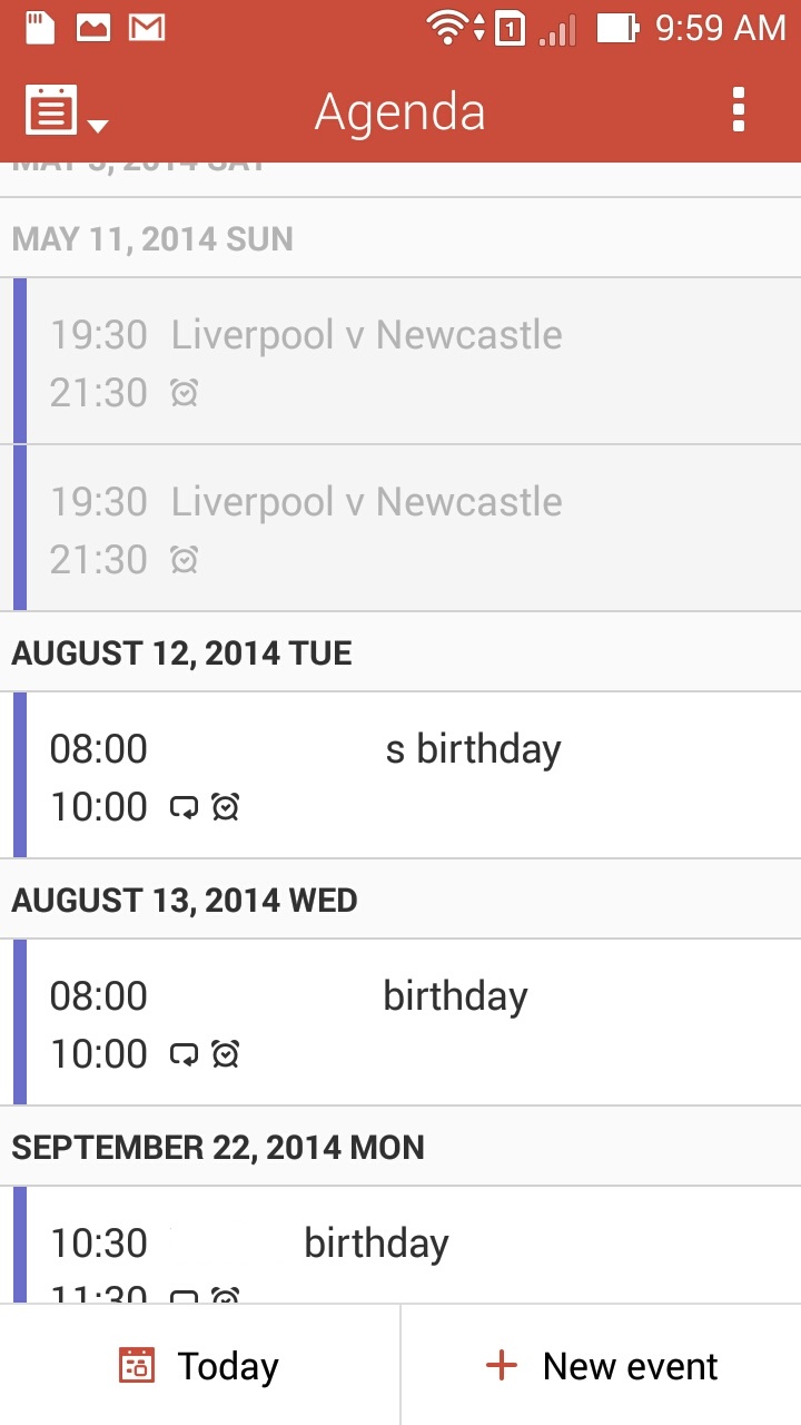
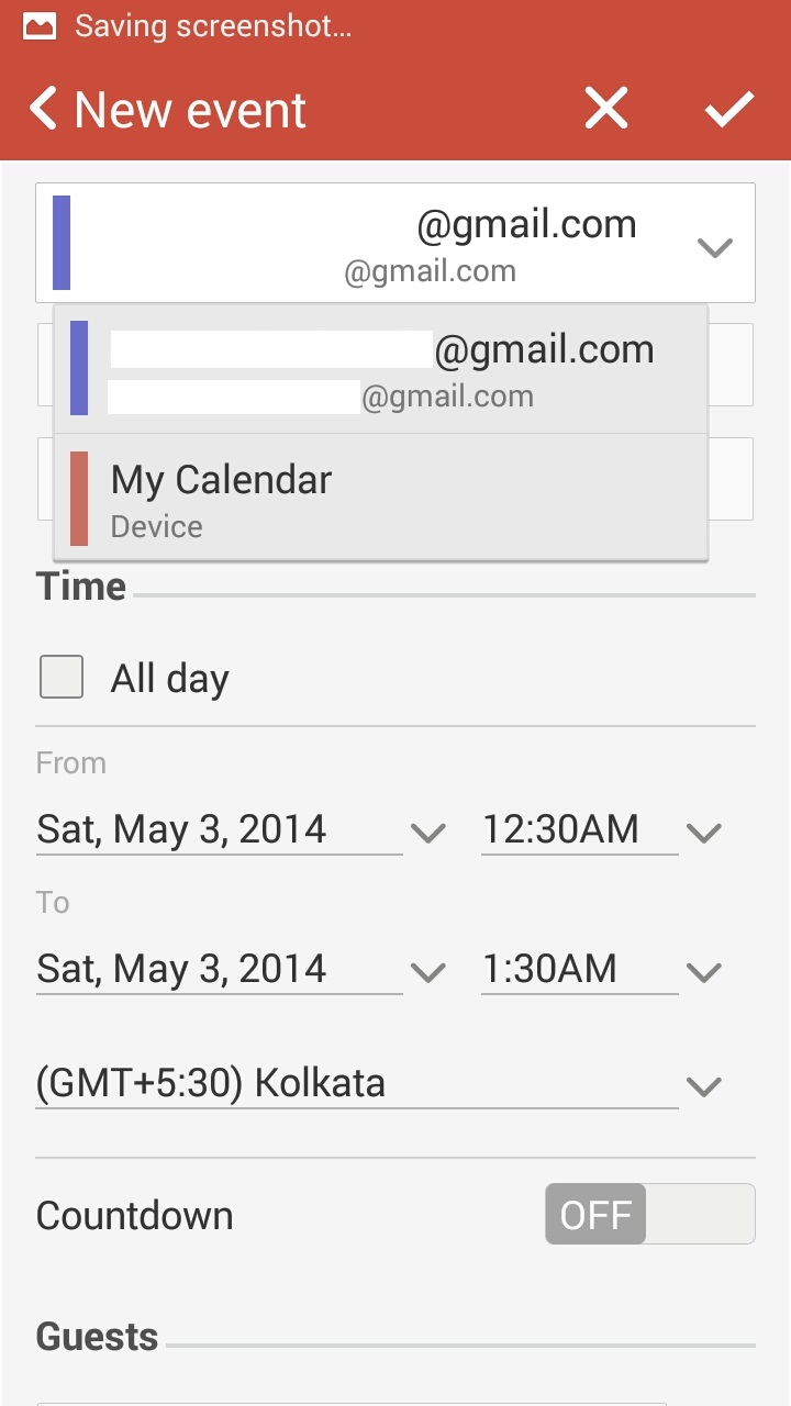
If you want to have a check of all your event details, go to Agenda view and you get a listing of all your events/meetings. While creating new event, you can select whether to save the event in the phone or to save the event to a specific online account. You can also add guests for the events and they too will get notified of the event.
Contacts and dialer
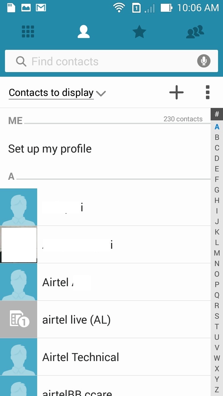
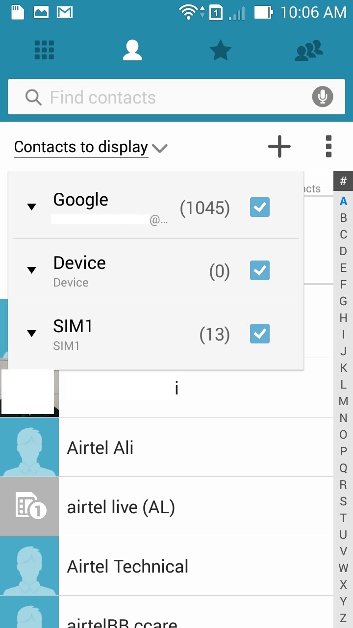
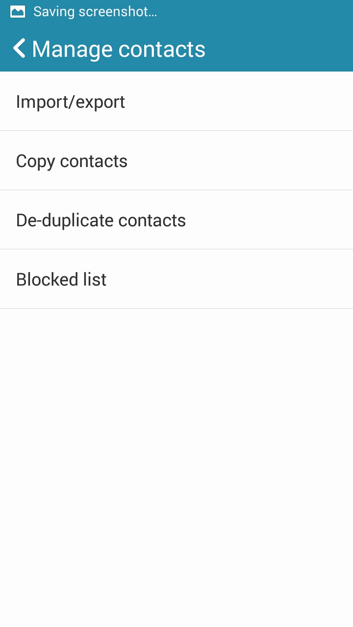
Contacts application is straight forward. The top bar gives you one click access to contacts list, favrourites, groups, dialer and there is a search bar below the top bar where you can search based on name or phone number. You can select the account/device from which the list is picked up (mail accounts, sim, phone storage etc). From main menu, you can share contacts, merge contacts, remove duplicate contacts, delete multiple contacts, manage contacts, account and settings . As usual, you can only store very basic contact data on a SIM while if you choose phone, you have wide number of fields to store. There is a build in options to add numbers/contacts to blocked list and block calls or messages or both. You can select these numbers from your contact list, add number manually or add internet call list.
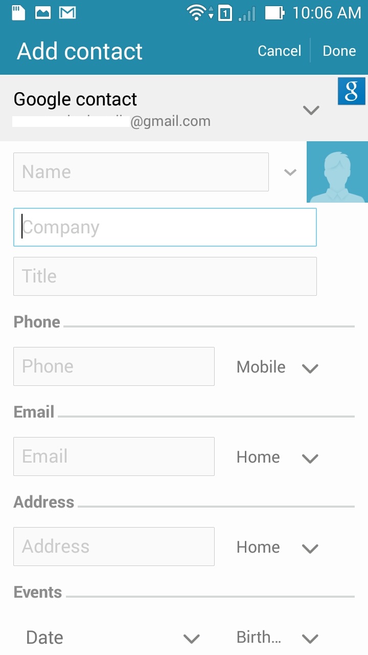
Similar to most other contacts app, you can have favorites and organize contacts into groups. For groups, you can add a cover image for the group or set a default group cover.
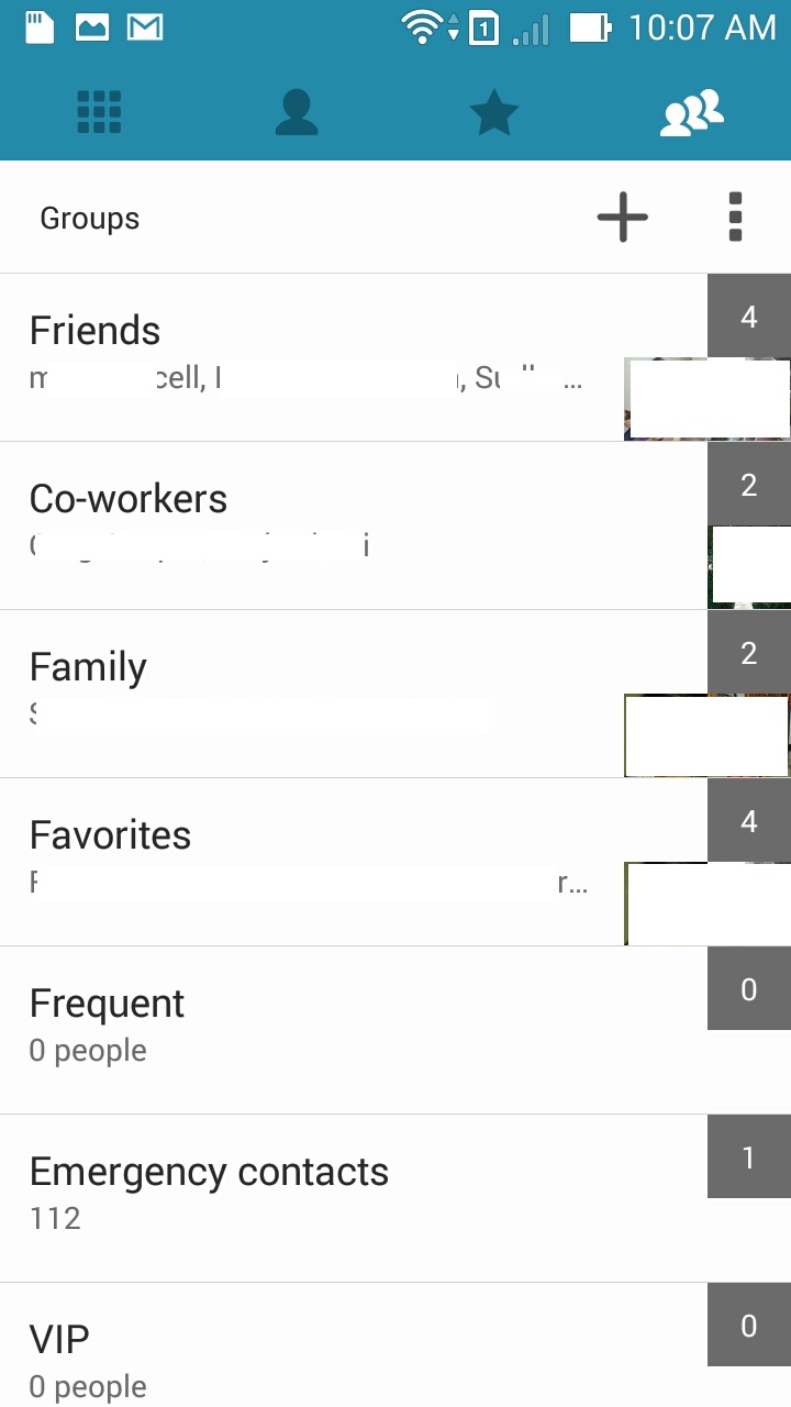
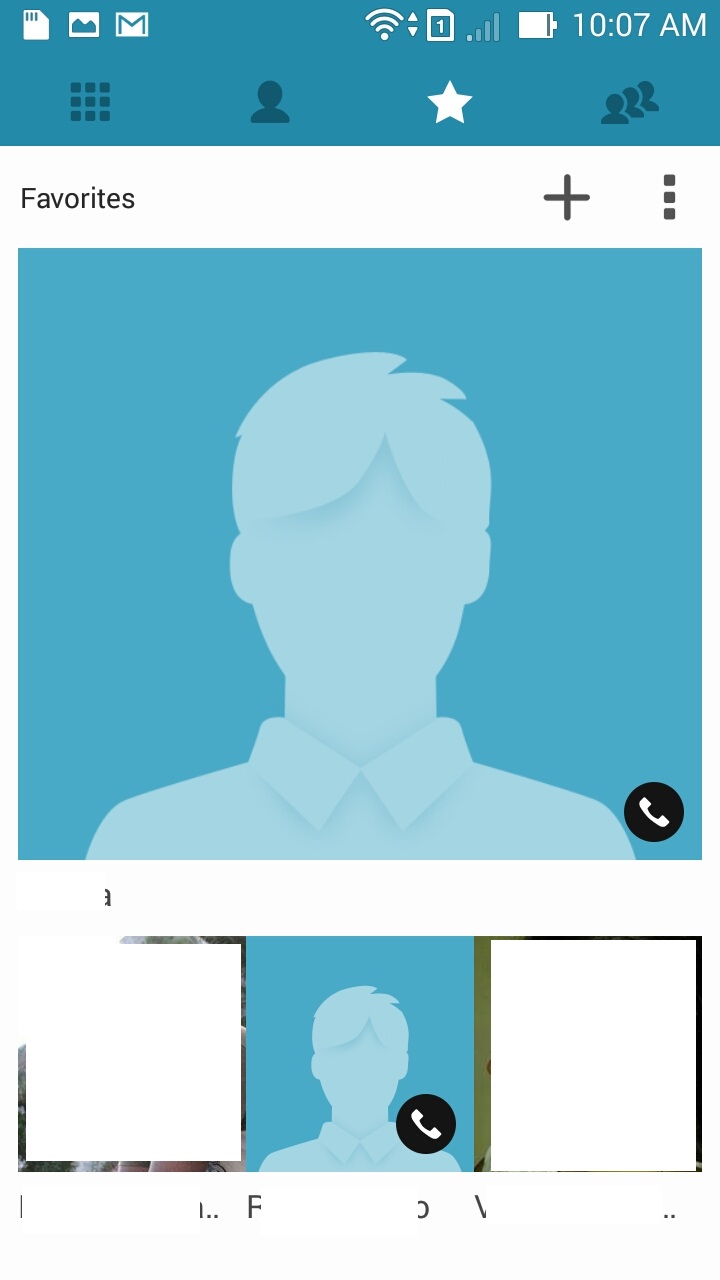
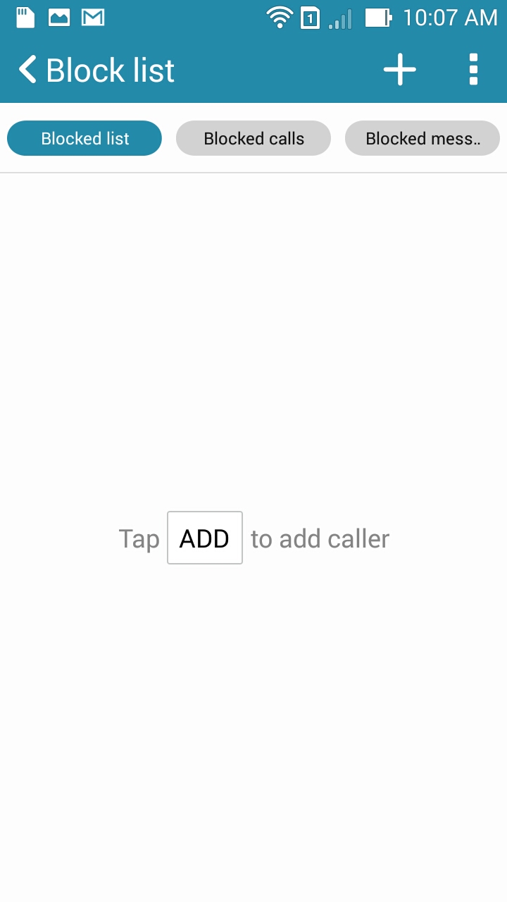
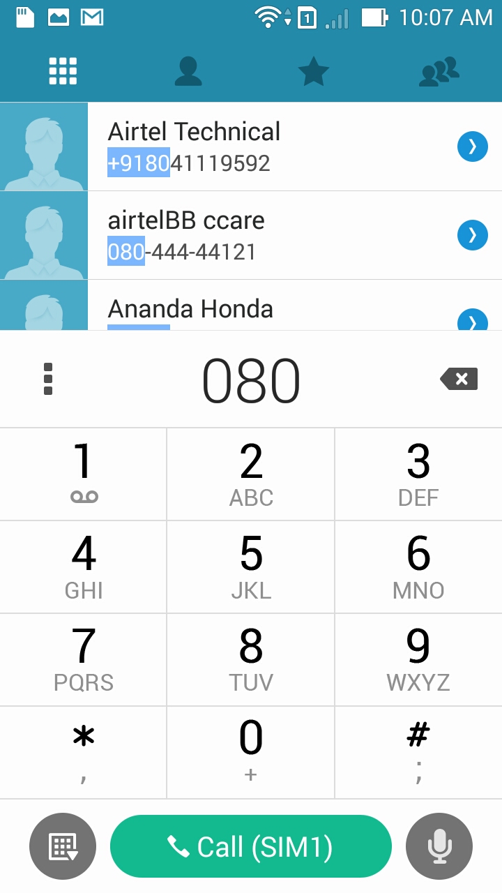
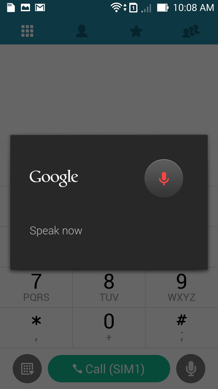
Dialer is another clean looking application on this phone. Black text on white background gives it a clean look, start entering numbers and you get the list of contacts that partially match and then if there is any contact that fully matches the number, you see the contact in empty space. You can select the sim to use to place the call (as this is a dual sim phone). You can also place a call using Google Voice by tapping the mic button next to the call button (bottom right corner).
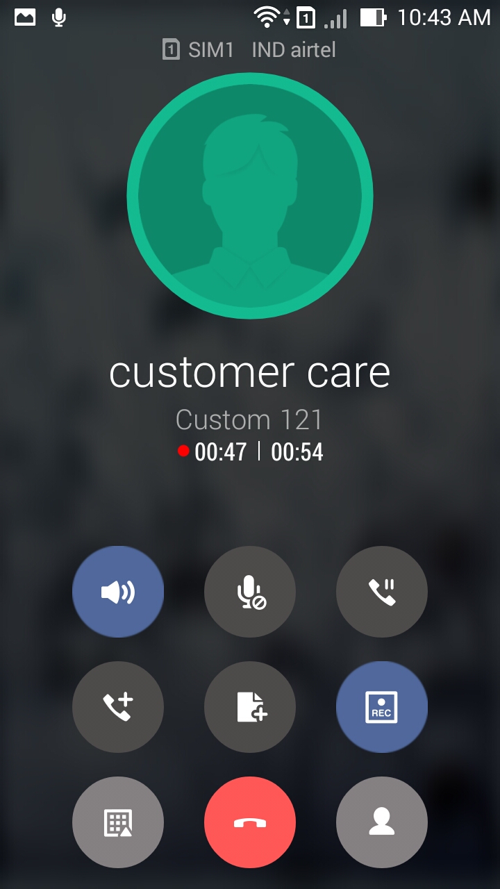
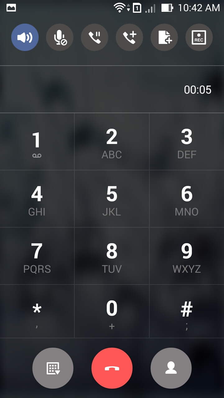
While in a call, you have options to mute/unmute, open number pad, hold/unhold, add another caller. The best feature here is that you can record a call without the need to have a 3rd party application. Click on the ‘record’ button and the call is recorded.

Messaging
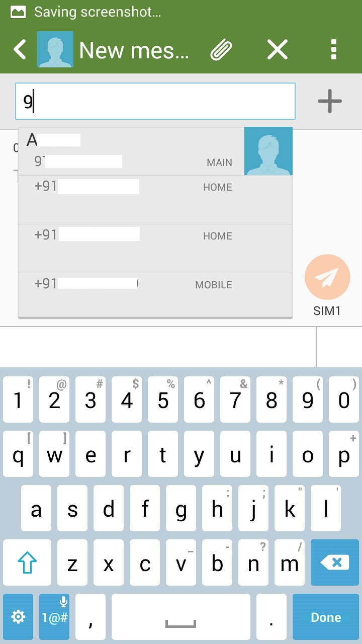
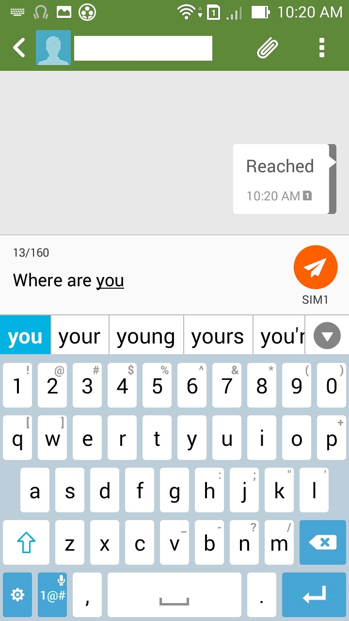
The default view, like on any other Android device, is sorted by contacts and is threaded messaging. The top bar has one-click access to search, new message and settings menu. Click on new message, start entering the name in text bar and you will see the matching contacts. Select relevant contact and you are ready to type the message and send. The application supports backing up and restoring messages.
To-Do
ASUS has built in ‘read it later’ feature into the phone. You can add documents, pages, reminders, youtube videos, text messages… The list is endless and this certainly is one of the best features built into this phone. Such is the extensive feature list that if you cannot take a phone call, you can add the caller to To-Do list. From the To-Do app, you can access these reminders and read it later docs/videos. You can set reminders and To-Do tasks from the application.
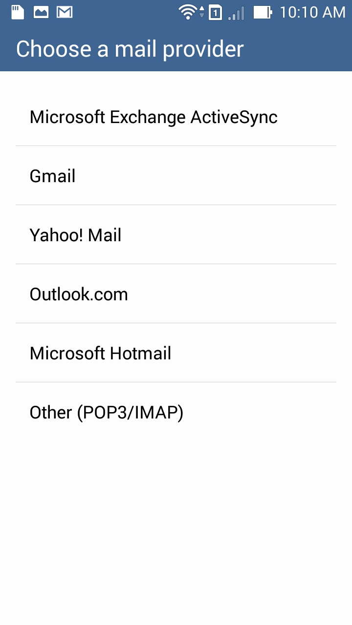
By default, ASUS supports Microsoft Exchange ActiveSync, Gmail, Yahoo! Mail, Outlook.com, Hotmail and you can also setup manual email sync using Pop3/IMAP protocols.
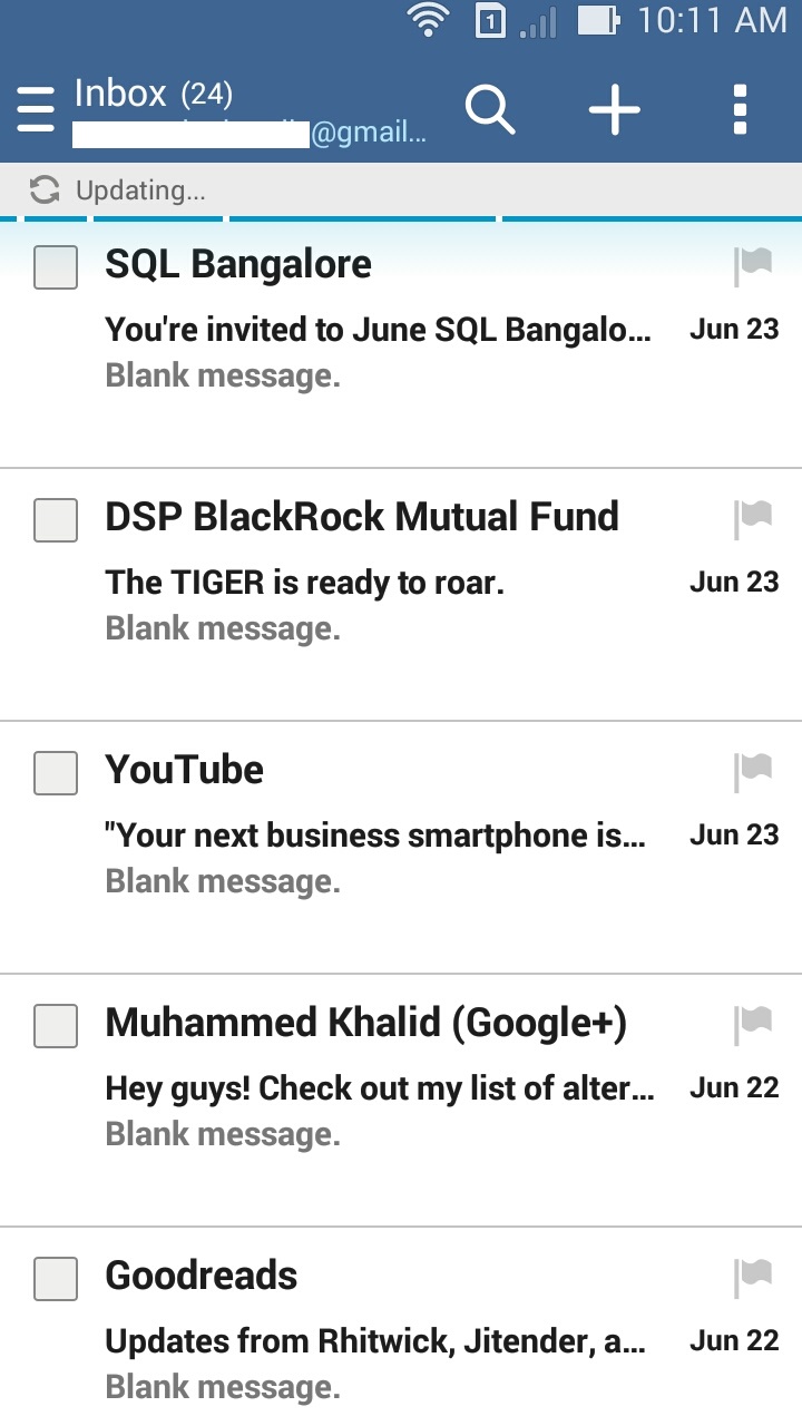
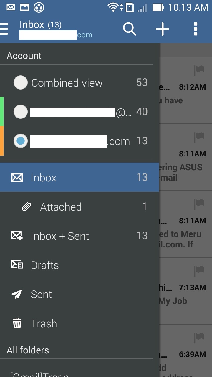
The default view contains list of email. There is lot of free space and it would’ve been better if there was more content visible in email list. You can also swtich to combined inbox (mails from all inboxes are collated into one list). When you switch to combined inbox, each mail account is assigned a color and a vertical bar will be added to every email in combined inbox view denoting the mail account that it belongs to.
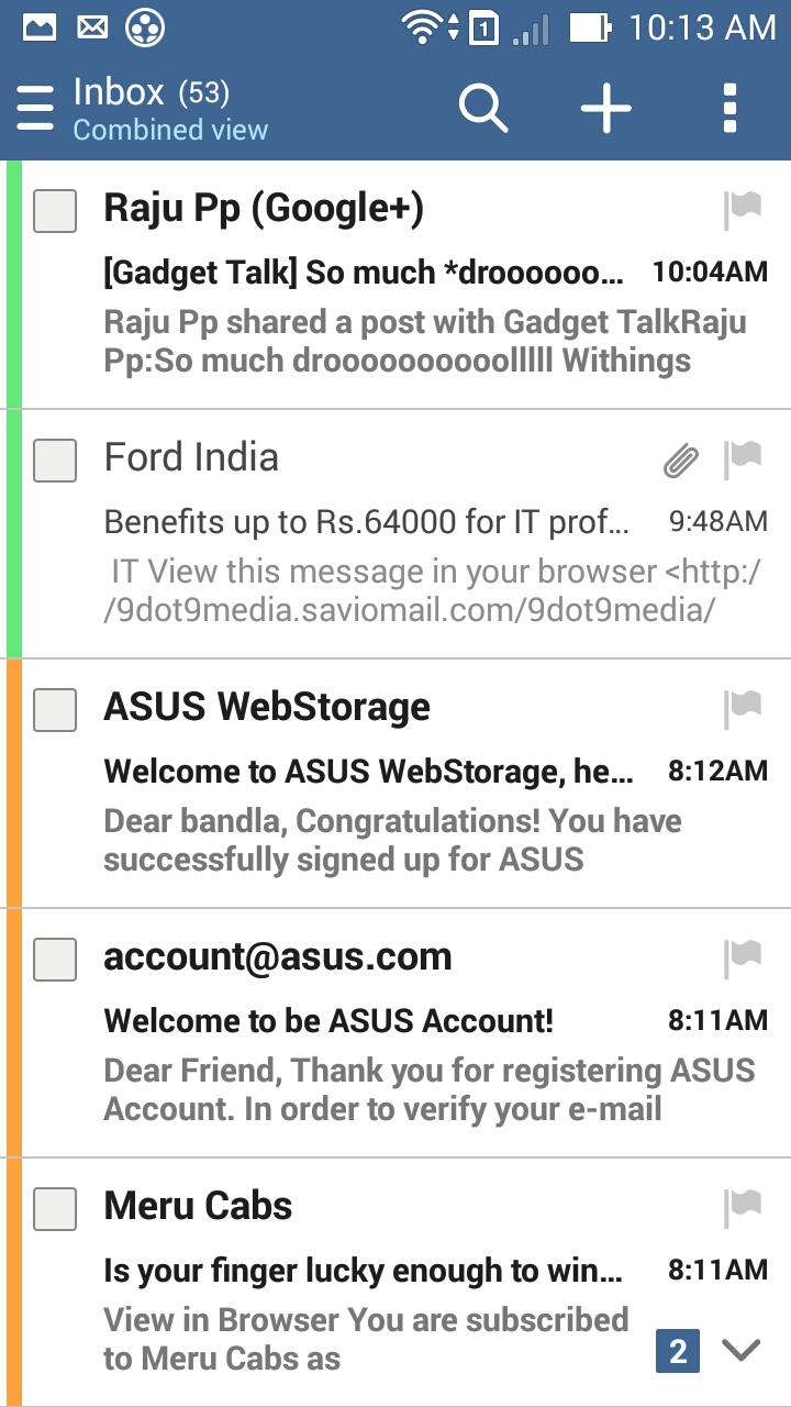
You can do a search on emails from the top bar and there is one click access to compose new email and access primary menu.
This is what the default mail view looks like in landscape view. The UI is clean and the images are displayed properly (if the image is too big for landscape mode, switch to portrait mode), alignment looks good too. From the email view, you can reply, reply-all, forward to the mail, delete current email or go to previous/next email.

File browser
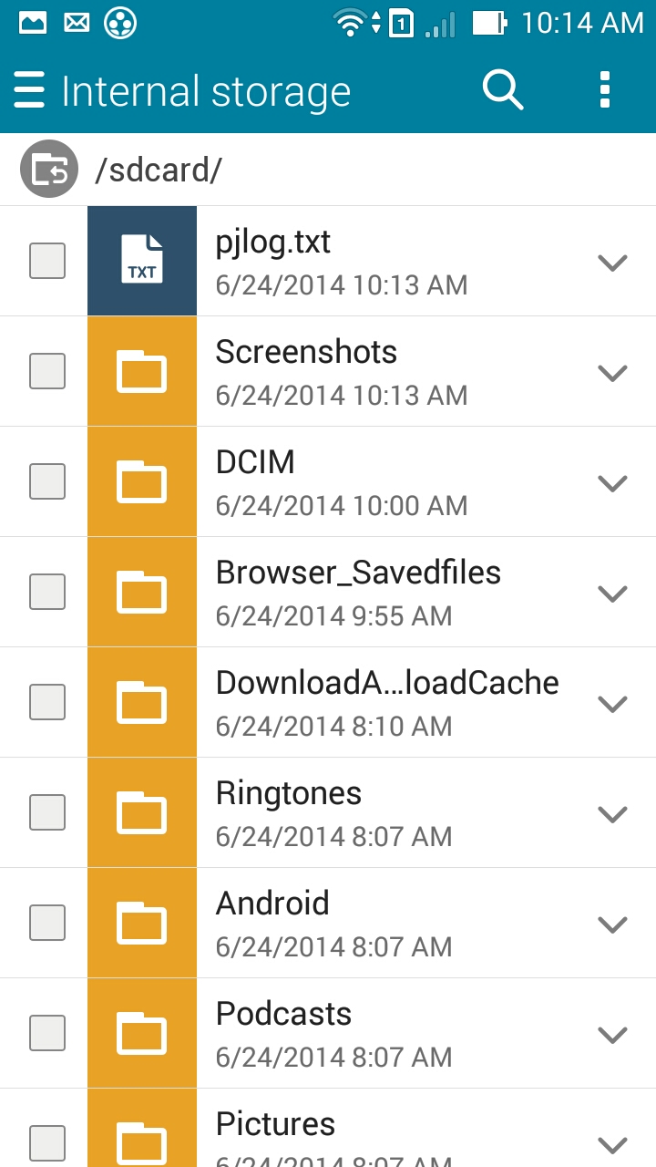
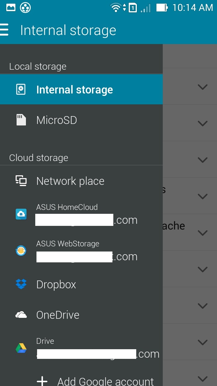
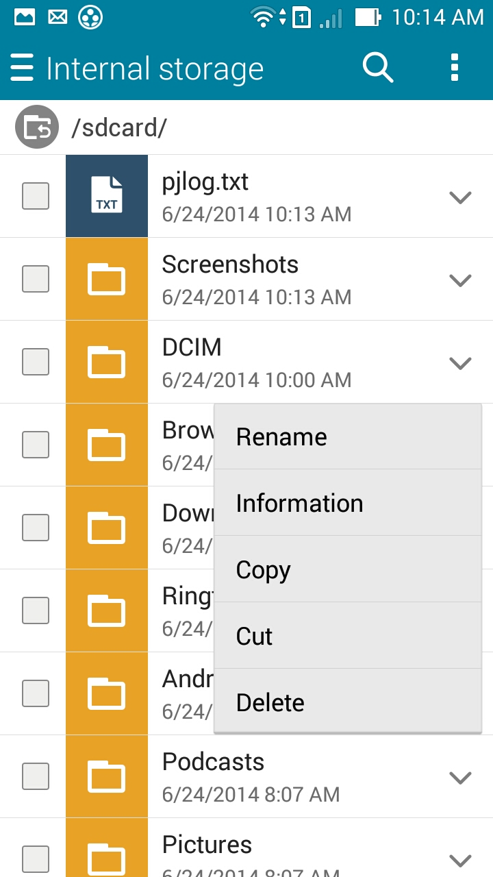
Apart from local files, you can configure the build in file manager to access content on dropbox, asus homecloud, asus web storage, onedrive, google drive etc. The support is extensive but the interface though looks and feels primitive. Not much to write about here.
Gallery
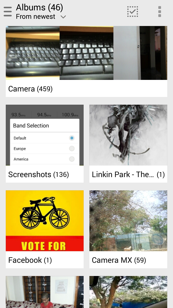
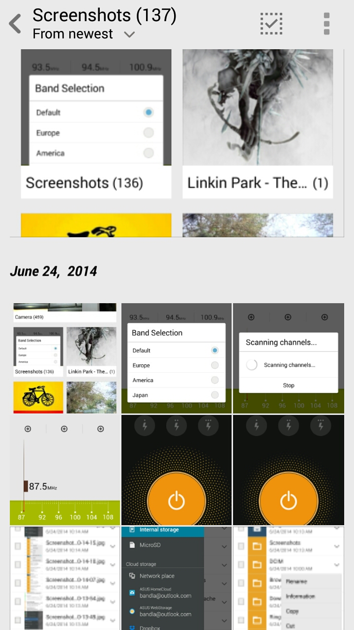
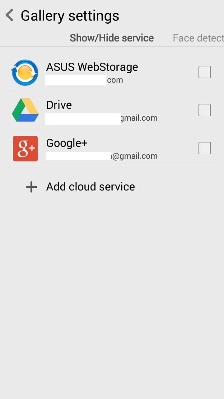
Similar to File browser, you can add cloud accounts to gallery application. You can use face detect feature to sort the photos based on faces or you can use the default sort by album option. From the gallery app, you can share the photo/album to/through various 3rd party apps/services.s
Clock
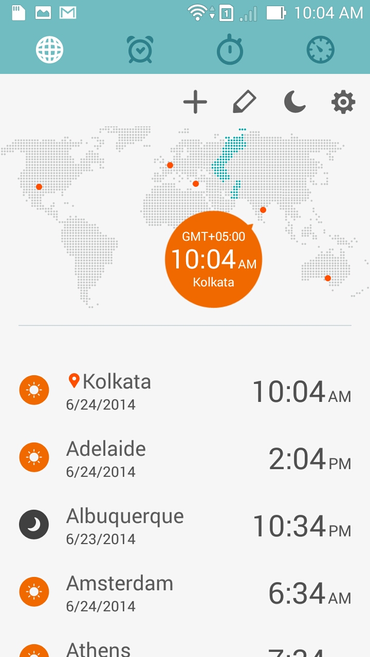
Clock apps is indeed good. The main page features a world clock and all the clocks that you hae set to view are displayed in a list on main page. You need to configure home clock/time zone that is displayed at the top of the list. The top bar gives you access to world clock, alarm, stop watch and count down timer.
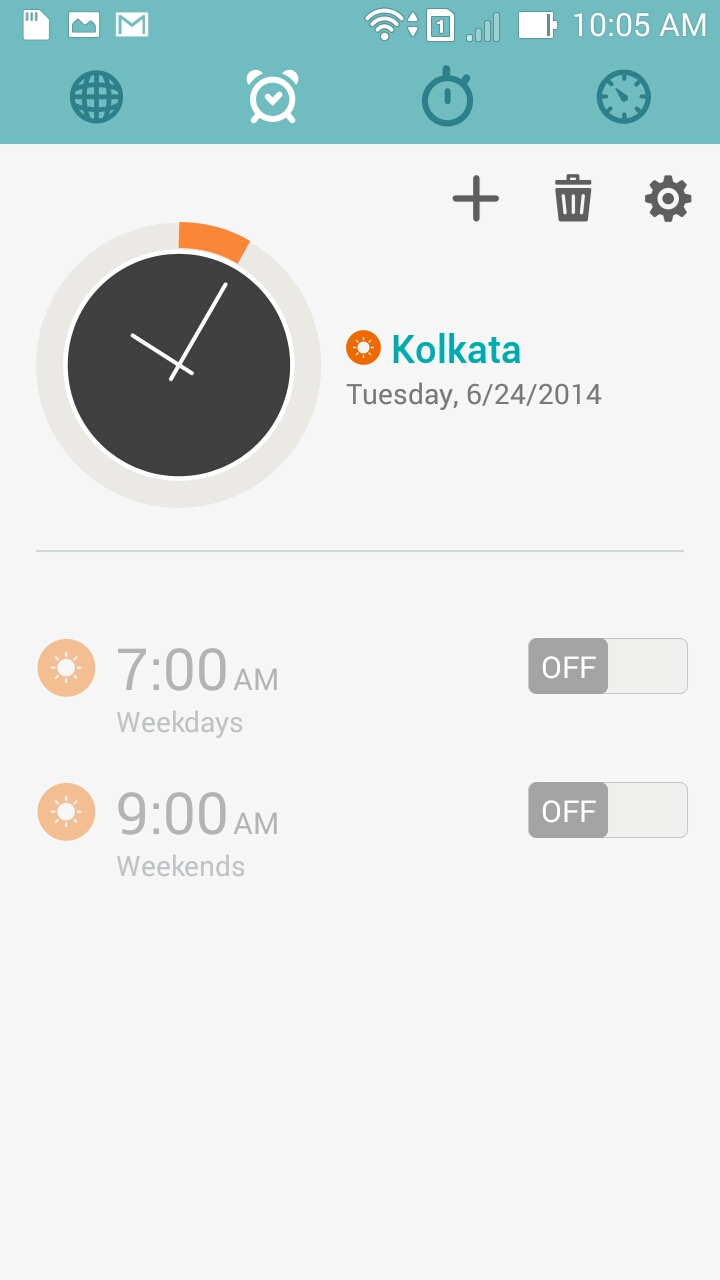
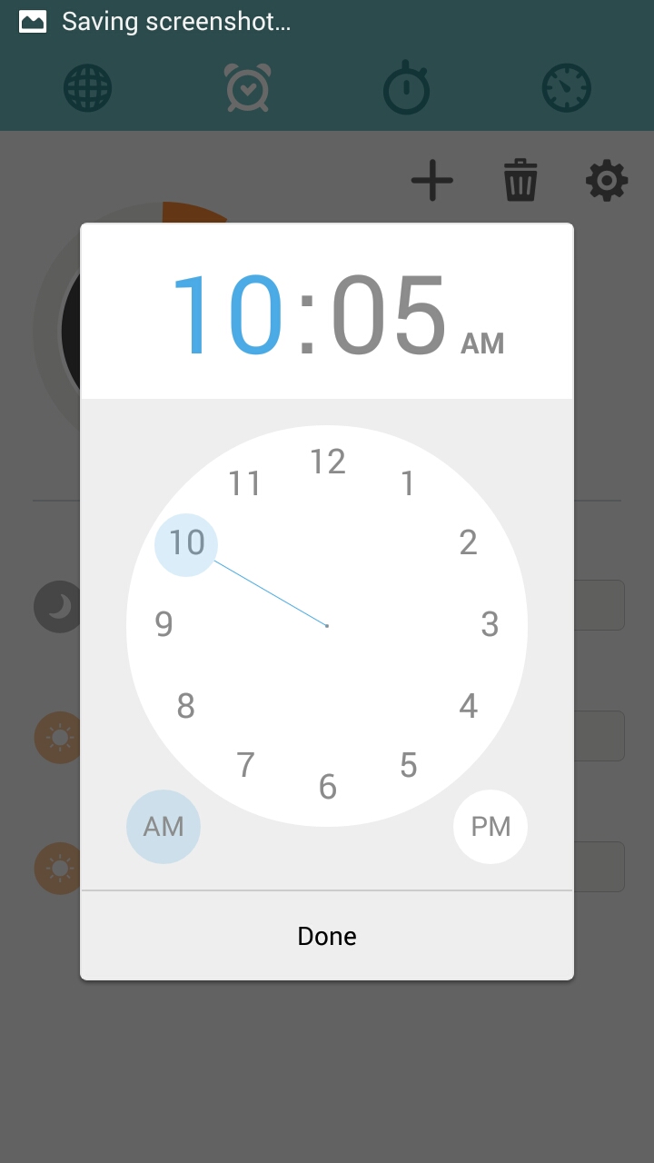
The alarms screen has a great interface. You get to see the lst of alarms and the current time, you can create/delete alarms from this screen and you can access the alarm settings. Giving a analogue dial to set alarm is intuitive and we prefer this lot more than swipe to select options that we see in other phones.
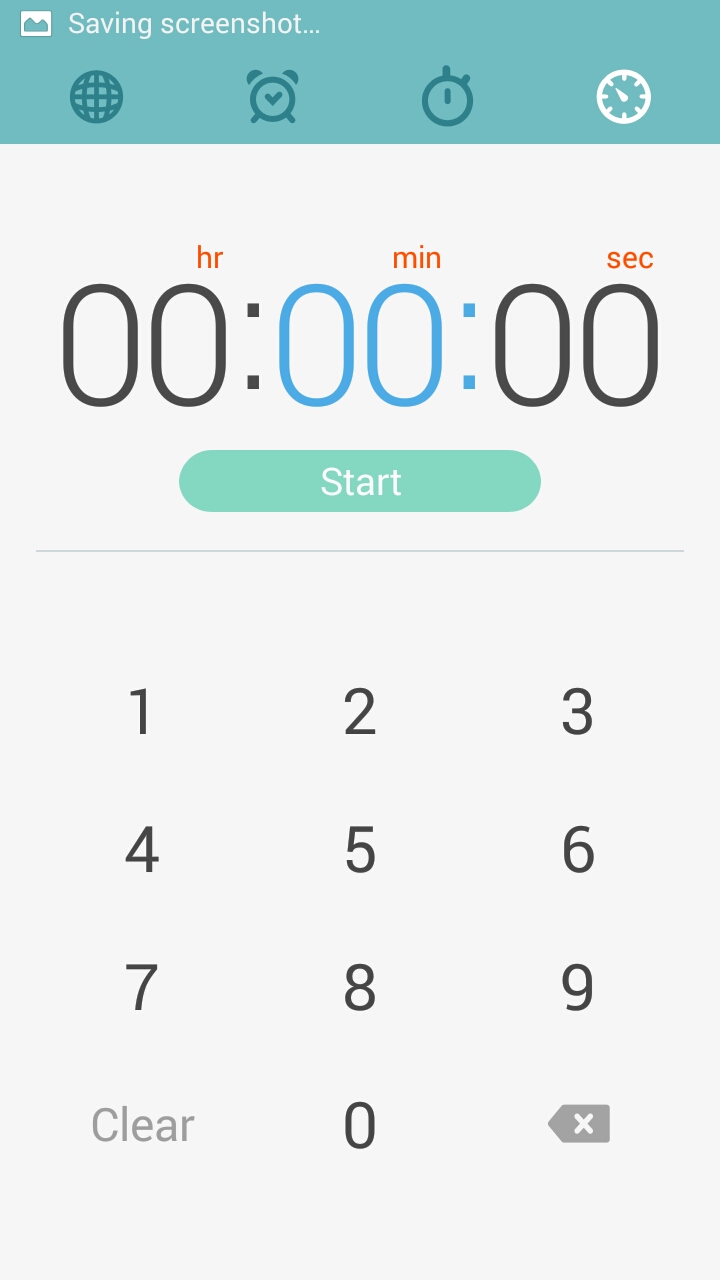
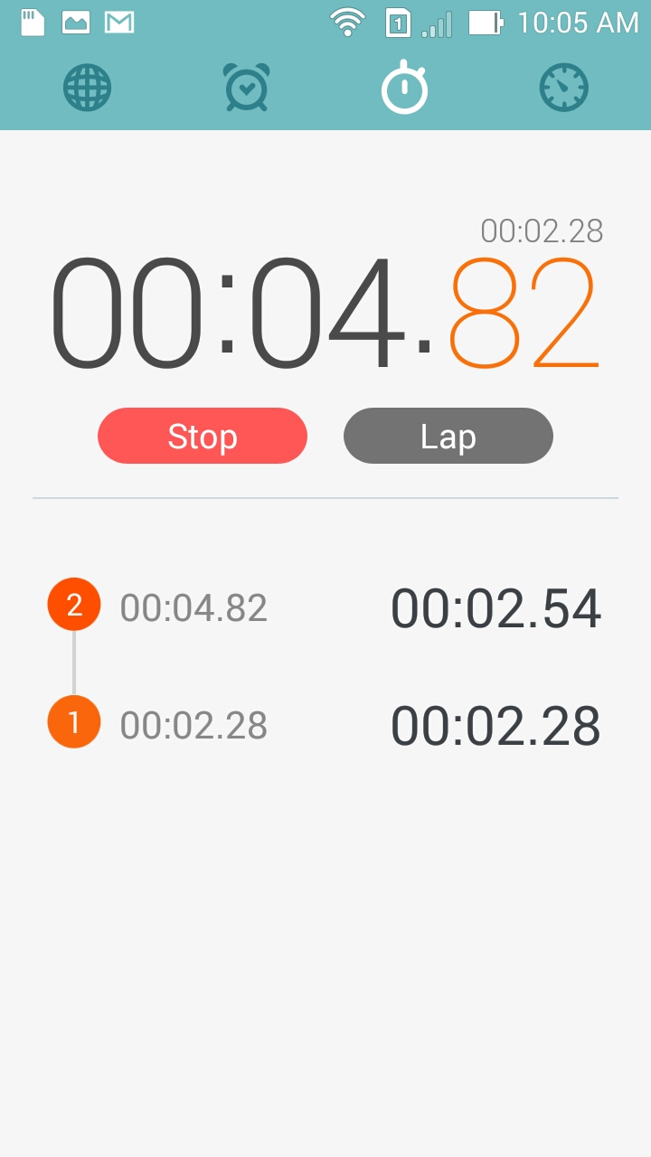
Lap timer and countdown timers are easy to use and this is how the interface is.
FM radio and music player
From music player, you can either access local media content or you can add your cloud storage(s) and the player will pick media from the cloud. It is indeed good to see ASUS giving importance to cloud content in ZenUI.
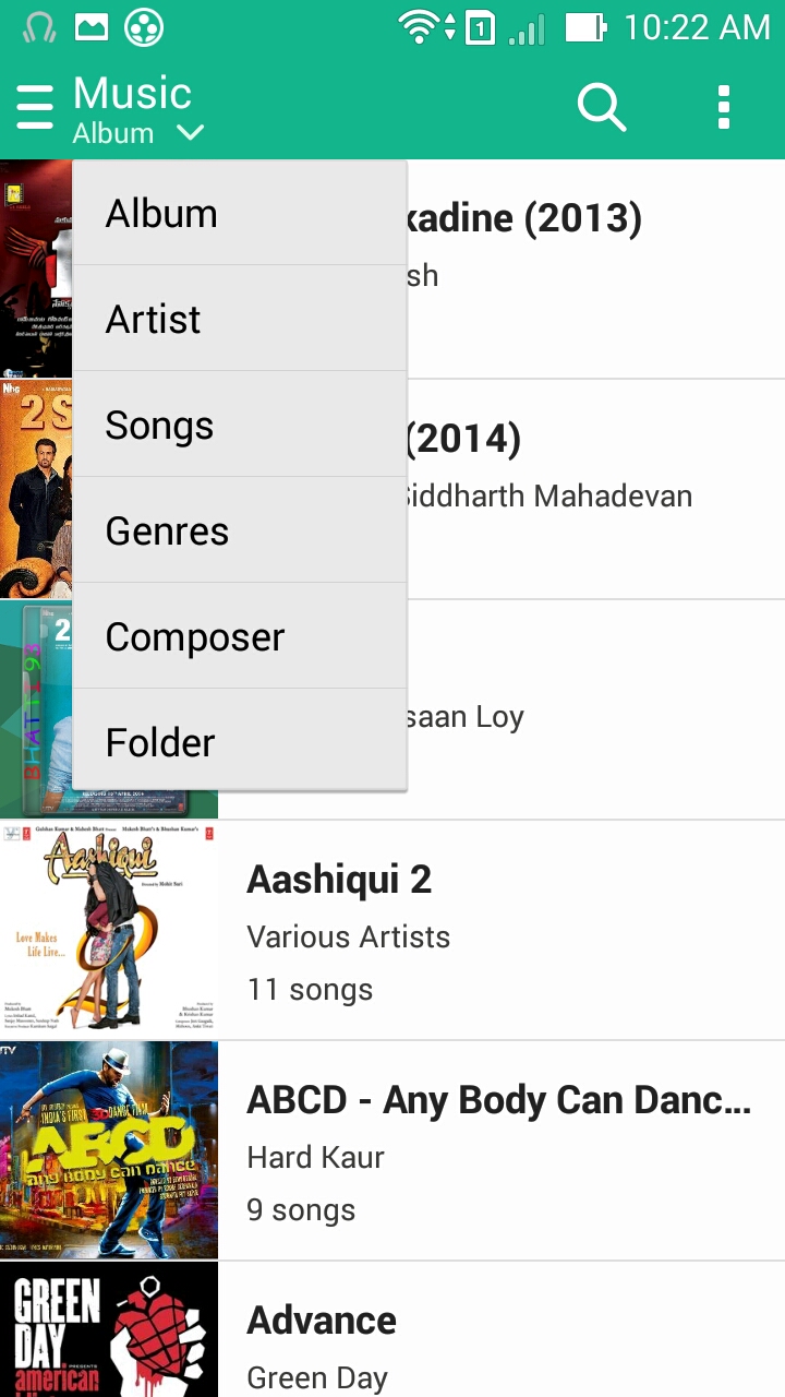
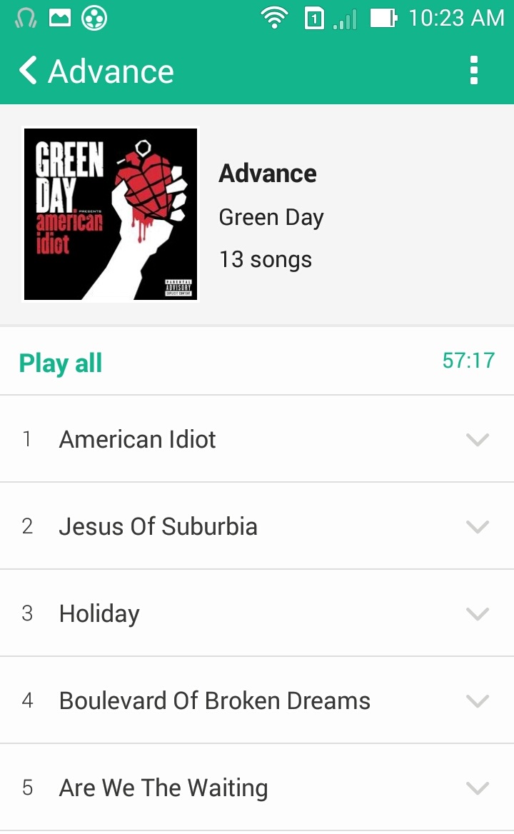
Default view is list view and similar to the UI in gallery and file browser, this is very basic. You can switch between album, artist, songs, genres, composer lists and you can also choose to list sorted by folders. If there is a song playing, there is a floating bar at the bottom from where you can pause the song and play next song.
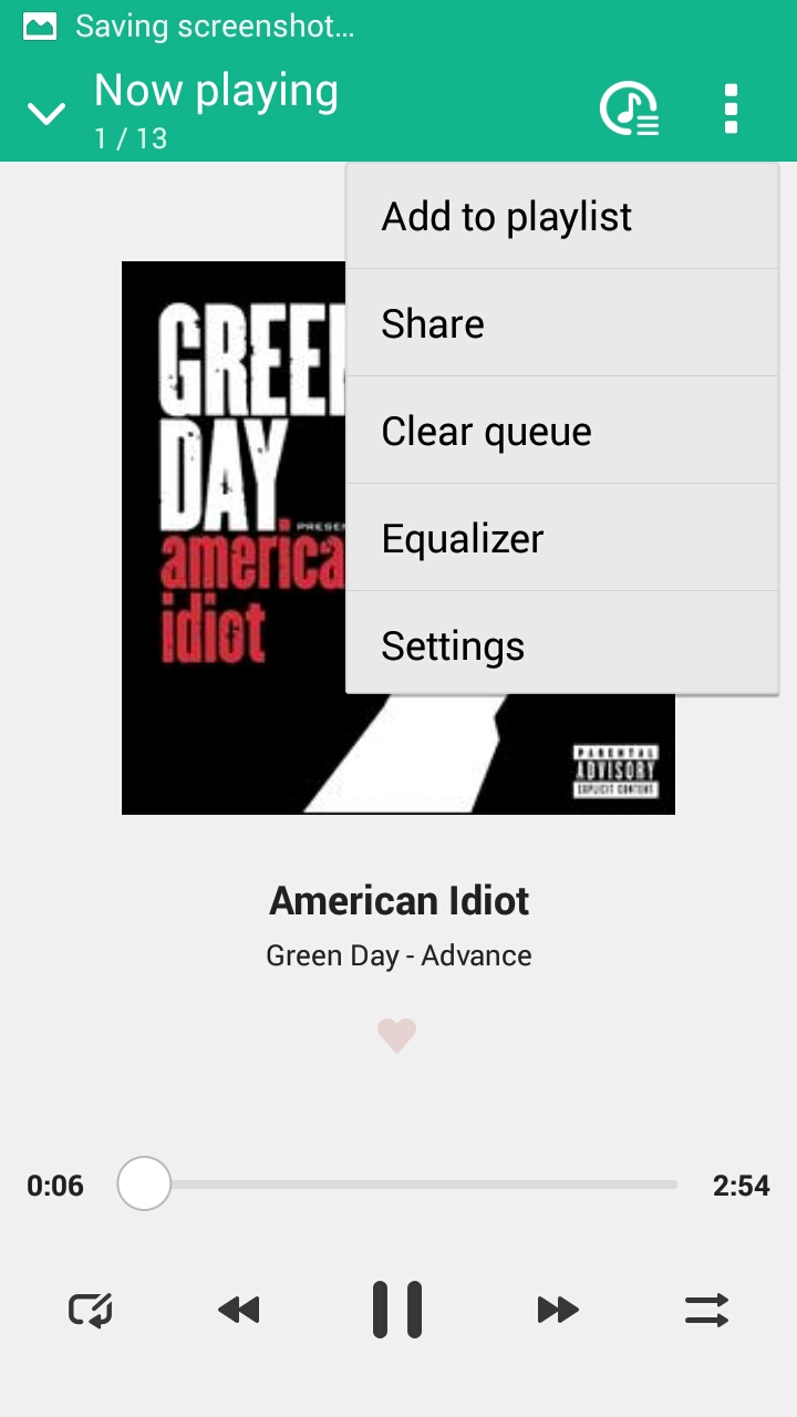
To pick content from cloud storage, pull the music menu from the left and pick the cloud service you want to use. From the left side bar, you can also access your playlists, favourites, newly added music and most played music.
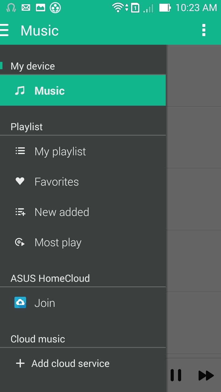
Once you start playing a song, the album art is centered on the screen and you get music controls, shuffle and repeat options and a faded heart shape, clicking on which you can set the song as one of your favourites.

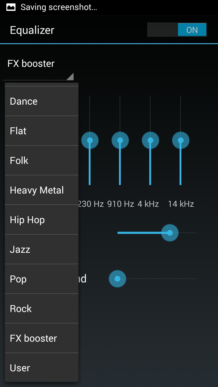
The audio quality via ‘good quality’ in-ear phones is pretty good. The volume is loud enough and the clarity is good. There is a five band equalizer with 9 presets and a custom preset for you to set to your liking.
FM Radio interface is straight forward. There are six stations that you can save to main screen and there are controls to switch between stations and a manual up/down frequency selector. Once you set the band (Europe, default, america, japan), the scan checks all available stations and lists them for use.
movie maker
We have not explored much here given the time constraints we had with keeping the phone. In short, using a movie maker, you can create movies from photos, videos on the phone, by taking a photo or recording a video on the fly or by importing video/image from your cloud/video portal.
Zen Link
This is a mix of four link applications that provide great features
Sharelink : Share files to other devices using Wi-Fi Direct.
Party link : allows you to connect to nearby devices and share photos automatically
PC link : Mirror your phone on your PC and use your phone from your computer.
Remote link : Control your PC from your phone as a remote (similar to apps like unifed remote for android), turn your phone into a touchpad, keyboard and even a game controller.
Again, due to time constraint, we couldn’t test each of these features in detail.
settings
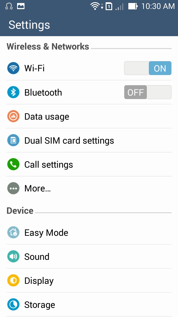
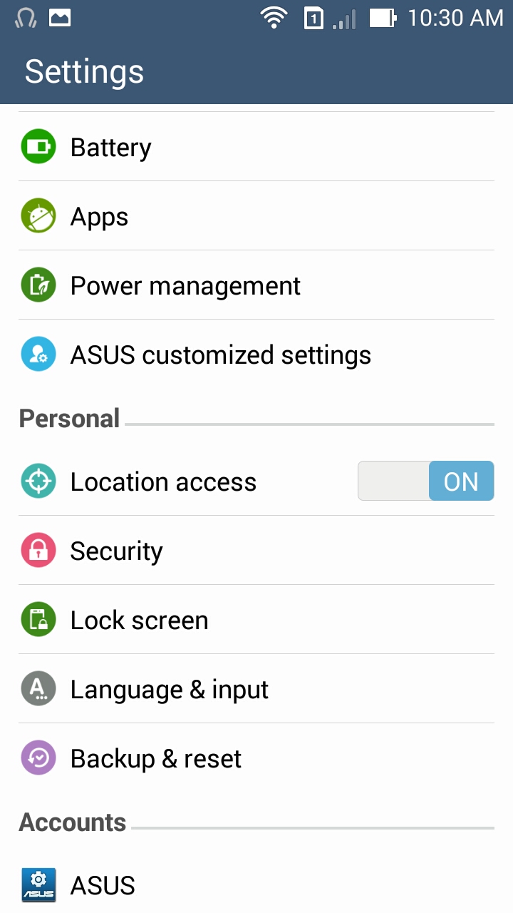
Unlike Android stock settings ui, this one has a black text on white background and it gives the settings menu a much better look. Rest is the same as you see on majority of devices and here are a few screenshots.
Camera
This is the most feature rich application on this phone. You are pampered with features in this phone. For starters, you can pick auto, time rewind, HDR, Panorama, night, low light, selfie, miniature, depth of field etc modes that you can select from the main screen. This is the main camera view:
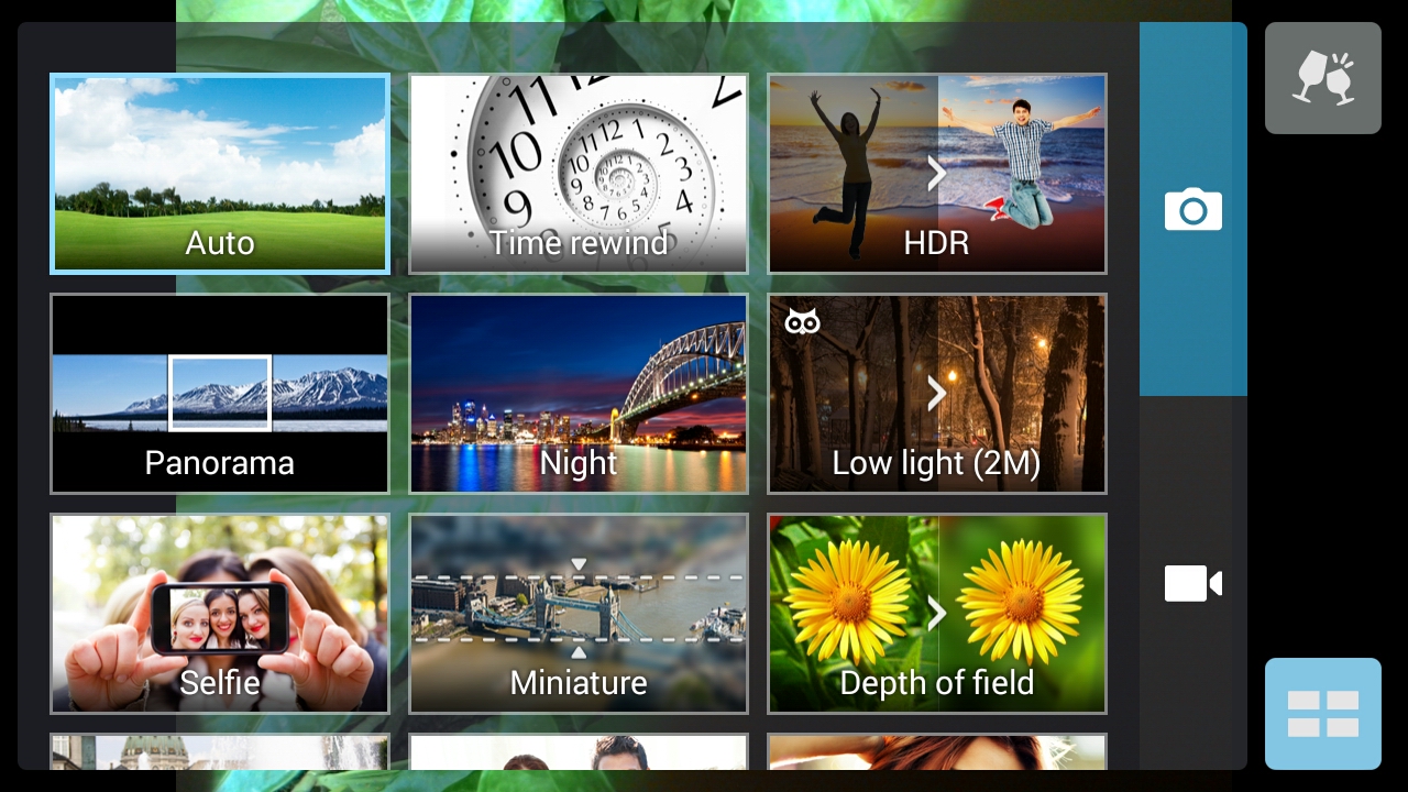
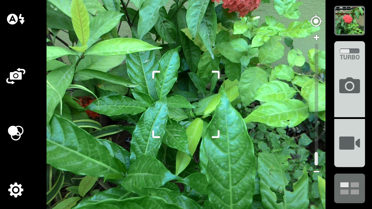
You can switch between video and photo capture modes, open photos taken in the past from right side bar and change various camera settings (flash, switch between front and rear cameras, filters and settings) from this view. Touch anywhere on the screen to focus on that point and use the shutter to take the picture. You can also use vol-up or vol-down to take a photo.
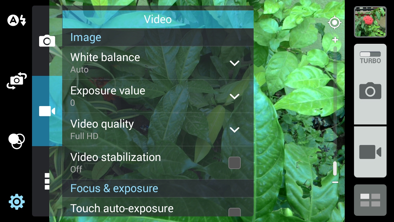
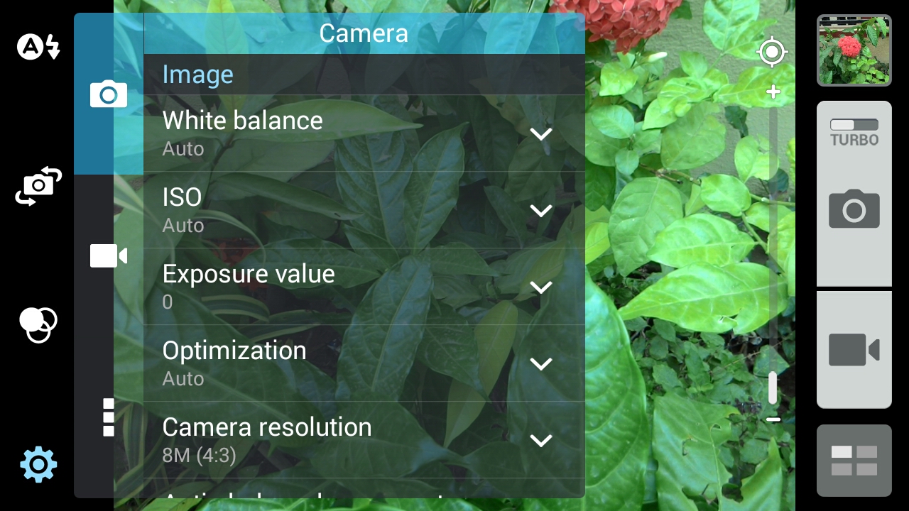
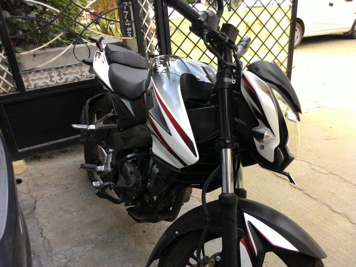
Image quality turned out to be pretty good and if you compare other phones in same price range, the camera is definitely better.


Conclusion
If you are on the look out for a lower mid range phone, we would certainly ask you to consider the ASUS Zenfone 5. The phone looks awesome, has strong build quality, has great camera and features and ASUS has wide support reach in India. There are handful of features that this phone has that makes it a better buy in its budget segment. This phone is sure to get lot of competition from Xiaomi Mi3 and Motorola Moto G though.
