Top 10 Android O features to look out for!
Android O is now officially called Android Oreo. Android O has a lot to do with background updates than the presentation layer. But still there are a few visual changes and feature additions as well. Here are the 10 new changes to look out for, in Android O.
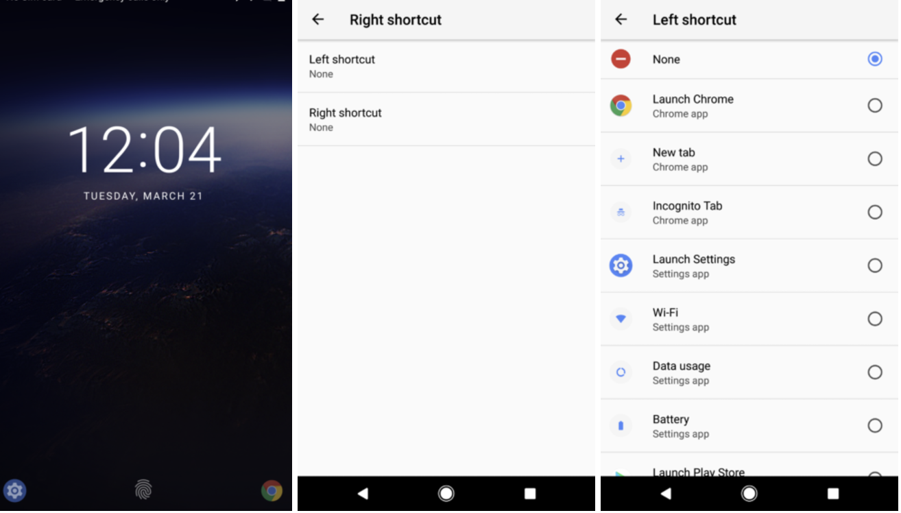
#1 Lock-screen shortcut customisation
Lock screen on Stock Android has been same for sometime now. Finally we get to change the shortcuts on the lock screen. You can customise the lock screen to open any apps of your choice.
#2 Context aware text selection
Android was first in introducing copy/paste in mobile. Now it has gone a level deeper to understand the text that is copied and give contextual shortcuts. If you have copied an address, you would get a map shortcut. If you have copied a phone number, you would see a Dialer on the shortcut.
#3 Navigation button positioning and customisation
The on-screen navigation keys can now be customised. Their location can be moved to right, left or spaced out or cramped. An additional icon of user’s choice of action can also be added on the navigation bar.
#4 Improved notifications
Notification section has got a whole lot of changes. Notifications can be snoozed. Notifications can be replied from lock screen. The animation as we slide down the notification shade is also pretty cool to look at.
#5 PIP mode
Gone are the days of split screen. Honestly, I have never used split screen and I don’t find it useful. But picture in picture can be useful. For instance, While browsing on a browser, I can keep the youtube video open as a small window over it. I find this to be a logical feature, compared to split screen, considering the size of the mobile displays.
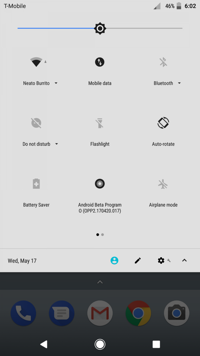
#6 Quick settings visual enhancement
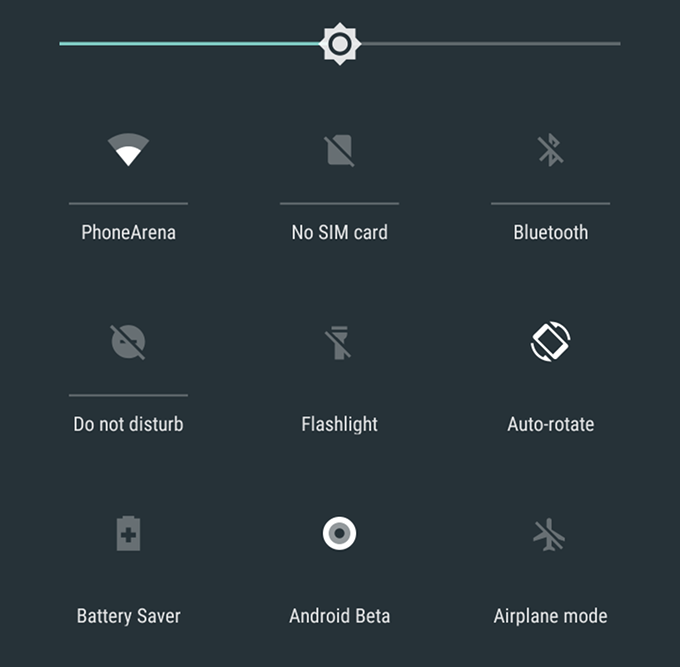
The quick toggle sections or the quick settings has got a bit more cleaner. The icons looks clean and nicely spaced out. Also there are some usability improvements like reducing the number of taps to get into some settings.
#7 New cleaner settings
The settings page is a to more cleaner. Sections like battery and storage, there are visual graphics to summarise the metrics.
#8 Auto fills
Auto filling forms is not new to us. We have enjoyed them in browser, but with Android O, that feature is coming to all apps. So next time you want to signup for an App, you need not type your email again.
#9 Adaptive icons
Adaptive icons is a long awaited feature on stock android. With this feature, your icons will take the shape as defined in the theme. Before this, if you have a circle theme, the icons were cropped. But with adaptive icons, the icons will never cropped, they will take the shape and animation as demanded / defined by the theme.

#10 Improved Battery
As with every release of Android, Google tries really hard to improve the battery performance. With Android O, the rules for the apps running on the background is going to be very strict. The doze feature did not impress me on Nougat or Marshmallow, but lets see if Android O does a better job in battery optimisation.
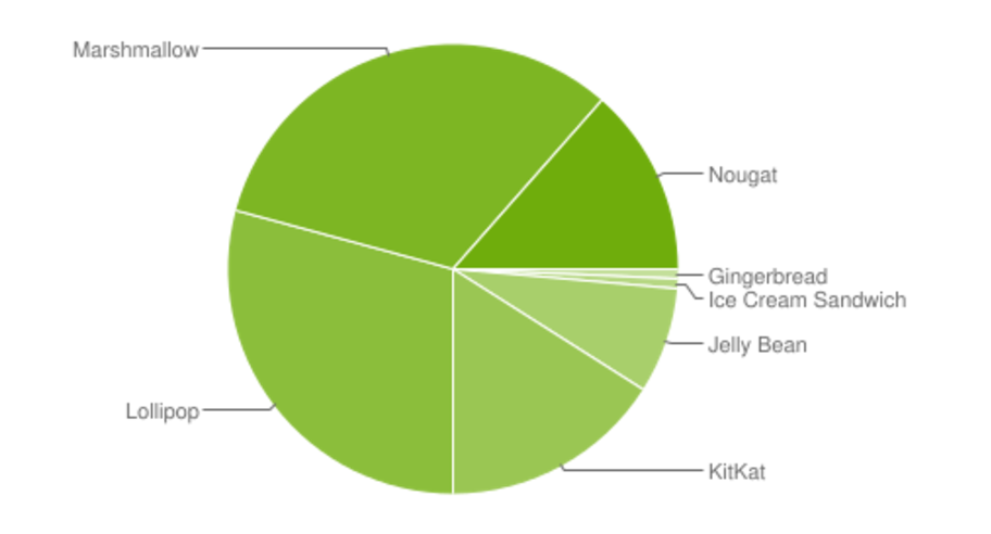
Most of these features have already been experienced on Android world, with Apps or on UI skins. But having these features are native set of features does make things a lot simpler and gives a consistent experience for anyone on Android. Considering the fact that the Nougat still has got a smaller market share than Marshmallow, I am not sure if Android O will make it to your mobile very soon, unless you have a Pixel. But then you are not going to miss out too much on the new update, even if you are stuck on Nougat.
In my personal opinion, Android O is nothing groundbreaking or innovative. I am not excited, but you tell me if you are excited and why.
Image credits – Android Police | XDA Developers

