From PC to Mac part II
You can find the first part of this article at http://www.gadgetdetail.com/pc-mac-part-1.They say that moving from Windows to OS X is easy but when you move from a Windows desktop to a Mac Mini, it ain’t easy. Using a keyboard and mouse designed to work with Windows was uncomfortable. I thought of using existing k/b and mouse for a while and then upgrade the mouse (not interested in changing keyboard as there is nothing for OS X that can match the ergonomic design of Microsoft’s natural ergonomic keyboard.
Still, I was not happy. I was expecting a great looking OS when I got OS X but the OS looked bland and nowhere near to how mac lovers described it. And there was serious amount of lag. I could hardly use Mail application and whenever I inserted SD card from my camera, the photo preview application would auto start and hang the OS. I was absolutely surprised to see ‘the worlds most advanced OS’ lag and hang.
Bootcamp and Windows
To make the transition easier, I installed Windows 7 using boot camp and Windows 7 OS on a mac mini turned out to be much clean looking and much faster than native OS X. On the same monitor, same hardware, OS X looked lot less fresher than Windows 7. The entry level Mac computer may be tiny but it will need some serious fire power to impress those who move from Windows to OS X. And I had no choice but giving it the firepower it needed.
Reinforcements
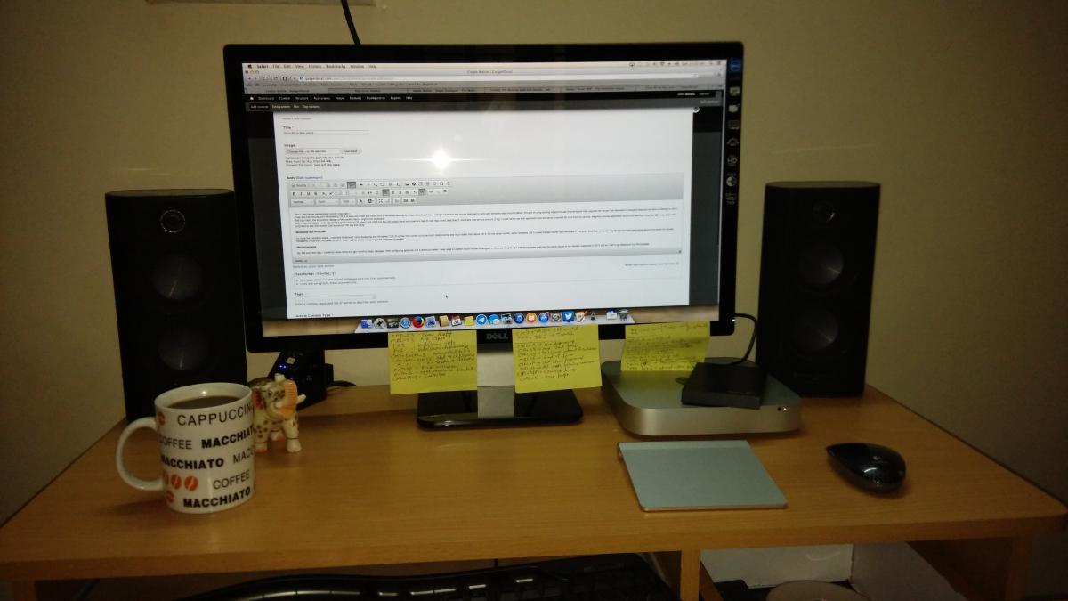
So, the very next day, I rushed to Apple store and got myself a magic trackpad. After configuring gestures, OS X felt much better. I was using a Logitech touch mouse to navigate in Windows 7/8 and I got addicted to these gestures.The same mouse is not ‘entirely’ supported in OS X and so I had to go ahead and buy the trackpad.
Then, I got an 8GB memory stick, taking the total amount of RAM to 10GB and on the same day, I purchased a Dell S2440L 24” FullHD LED back-lit display to round of the purchases.
It was after these upgrades that I understood that OS X was not supposed to be used on old hardware. Apart from being slow, it will not look like an OS that is sculpted to look gorgeous. My previous display was a Dell 19” 1440 x 900 16:10 aspect ratio display and OS X looked absolutely hideous. I just couldn’t use it and I had no other choice than to go for a quality FullHD display.
RAM: The lag was gone and the applications did not go into hung state once the RAM was upgraded to 10 gig. I could finally use OS X without getting irritated. After noticing the amount of lag on 4 GB of RAM, my respect for Linux and Windows developers went up many fold. Compared to Apple developers, their products cater to far wider users/devices. And yet, take Windows 8 or latest versions of Linux distros and they work very well on old hardware. I can imagine how slow OS X will run if I installed it (if I get to) on my decade old desktop. By the time the OS boots, I can learn and give a Bharatnatyam performance.
Trackpad: Kudos to Apple for bringing this out. Thanks to the huge capacitive touch area, scrolling and gestures are effortless. It is devices like these that make Apple stand out. Another great hardware product from Apple’s stable. If you want to get the most out of OS X, this magic trackpad is highly recommended. There are dozens of gestures that can be configured to use on this.
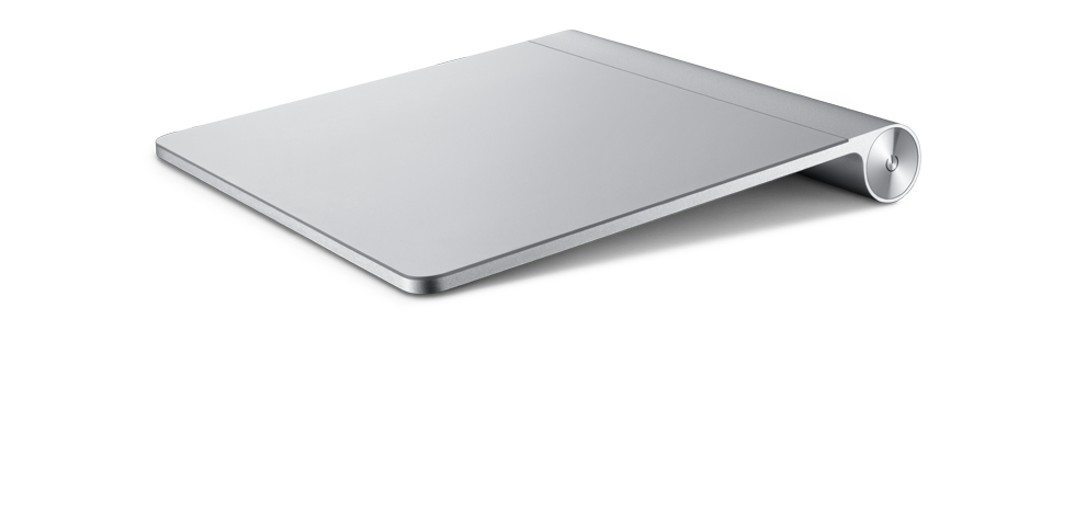
I love this one! For first few days, I had to resist the urge to lick it. Not that it is not edible but because, my house is not too far from an asylum. People say that computer is my first wife and I am trying hard to disprove that statement. Ever since iOS and Android started taking over the gadget world, we became used to lot of gestures. Using simple gestures for an operation on a phone and then when you sit in front of your desktop, you have to do multiple clicks to perform same action. Thanks to the trackpad, you can use same gesture for the same action and this saves lot of time in the long run. Powerful keyboard shortcuts combines with gestures is the way to go to achieve fast actions.
Microsoft did add support for gestures in Windows but is yet to catch up with Apple in this department.
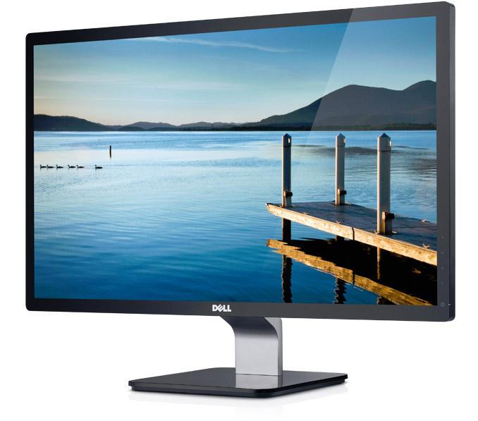
Display: The difference one sees when they upgrade from a 14” CRT to 19” LCD, the difference one sees when they upgrade from a 21” CRT TV to a 37” HDTV, the difference one sees when they upgrade from a Samsung Galaxy Star to a Nexus 5. That is the kind of difference I saw when I upgraded from a 19” LCD to a 24” FullHD display. I am not at all exaggerating here. The difference is stupendous and I now see why they all say that OS X is a gorgeous looking operating system. When I was using a 19” display, whenever I saw a retina MacBook pro or the MacBook air, i felt like I made a big mistake in buying a mac mini. But after upgrading the display, am feeling like the ‘king of the hill’. Full screen apps looks amazing, there is loads of real estate and the aqua effects are clearly visible.
The real fun though was when I upgraded to Yosemite (10.10). Though it took a while to get used to the ‘flat and simple ui’, I absolutely fell in love. The colors pop up, the UI looks simple yet elegant. The logos (iTunes, app store, calendar, safari especially) on dock look amazing! The new font introduced in Yosemite is easy on the eyes and is beautiful (Helvetica Neue family).
Adapting to the OS
Upgrading hardware is one thing but being a windows user from the day I started using a computer, getting used to the keyboard shortcuts, traffic lights (close, minimize, maximize buttons), app behavior etc took lot of times. By lot, I mean loooooooooooot!
Sometimes, I get a feeling that when apple designed OS X, the rule number 1 was ‘any shortcut that works on windows should not work on OS X’. The worst of all was behavior or application windows. Clicking on enter key after selecting a file does not open a file/folder, it lets me rename the file/folder. Close is not exactly close. In Finder, del does not mean delete, multi select -> right click -> get info will open truck load of windows where each window shows info of each folder, backspace will not take you to the previous window. There are some things that made me scream “Why Jobs, Why?” (Disclaimer: not in the reference of God and no, am not talking about Sachin Tendulkar either). In the end, I did this:
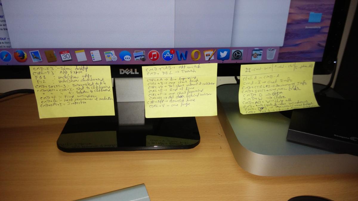
I heartily thank 3M for creating PostIt. This product saved my life. Given the headache, I would’ve had a heart attack by now. Do note that this is a headache not because of OS X, but because of the transition from Windows to OS X. I neither blame Microsoft not Apple for this. Its just that for some one who mechanically remembers most of windows shortcuts, the transition has been hard.
Another headache for me was how windows/apps behaved. Like I said before, close does not exactly close the application. close is minimize, maximize is full screen and I lost good amount of hair trying to figure out what the need is for that yellow colored button (in Yosemite) that has _ symbol in it. Also, when I click on ‘maximise’, instead of maximizing, the window stretches a little bit and suddenly forgets the action and ends up in weird size. Good that in Yosemite, maximize means ‘full screen window’. I miss the ‘snap’ feature in Windows 7 and 8 where you can gel two windows together and do multitasking at same time. In OS X, you need to do it manually.
Enough of your whining!
Lets move on to the good things now (taking the case of ideal hardware). If you ask me to describe the operating system in one word, I would say ‘Clean’. The OS is bloody clean, there is certain uniformity across the OS (that lacks in Windows 8 somehow). The best one is installing applications. In OS X, installing application is as simple as dragging the image to applications folder. Yes, it is that easy and there is absolutely no need to reboot the device. OS X recognises NTFS/FAT file systems while Microsoft is yet to add support for Linux file systems. This shows how much Apple have evolved from being a cry baby and is giving us that flexibility to let us have multiple operating systems.
Finder: Lets say that this is the Windows Explorer alternative but is much more powerful than explorer. File/folder tagged by color, tabbed finder windows makes working with files and folders very easy. I love the ‘column view’ in finder where you need not move up and down folders to check content. I also love the fact that I can simply double click on a text in any application and search on Google or add the content to note taking apps or post it to twitter.
Launchpad: gorgeous looking icon grid. All the applications are accessed from here. It gets even better in Yosemite.
Safari: This is without a doubt a much better internet browser that Internet Explorer. Fast, reliable, extremely easy to use and is secure too.
Mail: Till now, Microsoft could not provide a great free mail client. The native mail app on OS X hangs a bit but hey, it provides support for many mail services and also supports unified inbox. I don’t have to rely on apps like thunderbird to read mail.
Notifications: real boon to those who love to see Android like notifications on their desktop too. A two finger swipe from right side edge of trackpad opens notifications bar. notifications from apps that support this feature will be listed. you can either close notifications one by one or close all notifications for an app.
iTunes and application store: iTunes is without a doubt, one of the worst applications on a Windows machine but here, on an OS X, it feels like a champ. it is fast, it is clean and it does not crash/hang. Appstore is good. The problem is that I hardly see any quality app that helps me with day to day work. When compared to apps available for Windows, there is nothing here.
There are lot more things to discuss but let me add all that in my Yosemite review.
Wrap Up
I would not say that OS X is the world’s most advanced operating system. I would not say that Windows is better than OS X. While Windows trumps OS X in some areas, OS X is stronger in some areas. I did not go with Mac Mini to ditch Windows. There was this feeling in my head that I should give OS X a try (like I said before) and if I get a mac mini, I can run OS X, Windows, Linux on it. It also gives me an entry into the world of Apple (as I am looking to upgrade to an iPhone in a year or two). At the end of the day, I (who never used OS X as a primary OS) am able to use OS X (after some struggle) day in, day out and guess what, this is my first post that I composed entirely on OS X and it was good and easy experience. I have used ‘Pages’ application to get the job done (though I miss a full fledged writer that supports Drupal CMS). Windows has massive application base and there are many applications that I miss every day. Just few days ago, I wanted to root and install a 3rd party ROM on my Xiaomi Mi3 and the tool is designed to work only on Windows. I gave it a skip as I have to remove Yosemite beta to install Windows 8 and my heart took Yosemite’s side.
It was a bit hard in getting used to this, but once I started getting used to the OS, once I started using Yosemite, I couldn’t even look at OS X Mavericks. Going back to Mavericks from Yosemite is like going from a “F1 W05 Hybrid” to “E22” (F1 hardcore fans will understand this).
Will I go back to Windows? probably not! Will I ever use a Linux distro, most probably not! Will I turn into a mactard, definitely not! But I am definitely going into comfort zone w.r.t OS X.

